

If you Google ‘best web practices’ you are surely to get loads of articles on this topic…but which of these web practices are truly the best? For us at Kooba, we love the weeds…i.e. the data, the numbers…the things that might make some agencies run for the hills. We trust the practices that are rooted in research on human behaviour, and how people interact with certain web development features. Not only do we keep up with the latest digital design trends and research, but we test our own designs as well. Of the many findings on digital design psychology, here are a few of our favourites we’ve implemented for our clients that we know your users will resonate with.
Negative space
Don’t let the term put you off - negative space, or empty space, lends so much power because it gives your user some space to breathe. We know there’s loads of information that you want to include on your site, and it’s tempting to put it all out there. But trust us, all that information will end up canceling each other out if it’s not given its own space to stand out.
Step back and think about what you really want to highlight with your website. Is it a specific message? Is it your range of products? Whatever it is, that’s what you should be making space for. In the case of Flipdish, their product imagery is the star of the show.
We designed the negative space in a way where the mobile interface spoke for itself, and other elements took the backseat. This way, there’s no confusion about what the user should be looking at – it’s all about the product.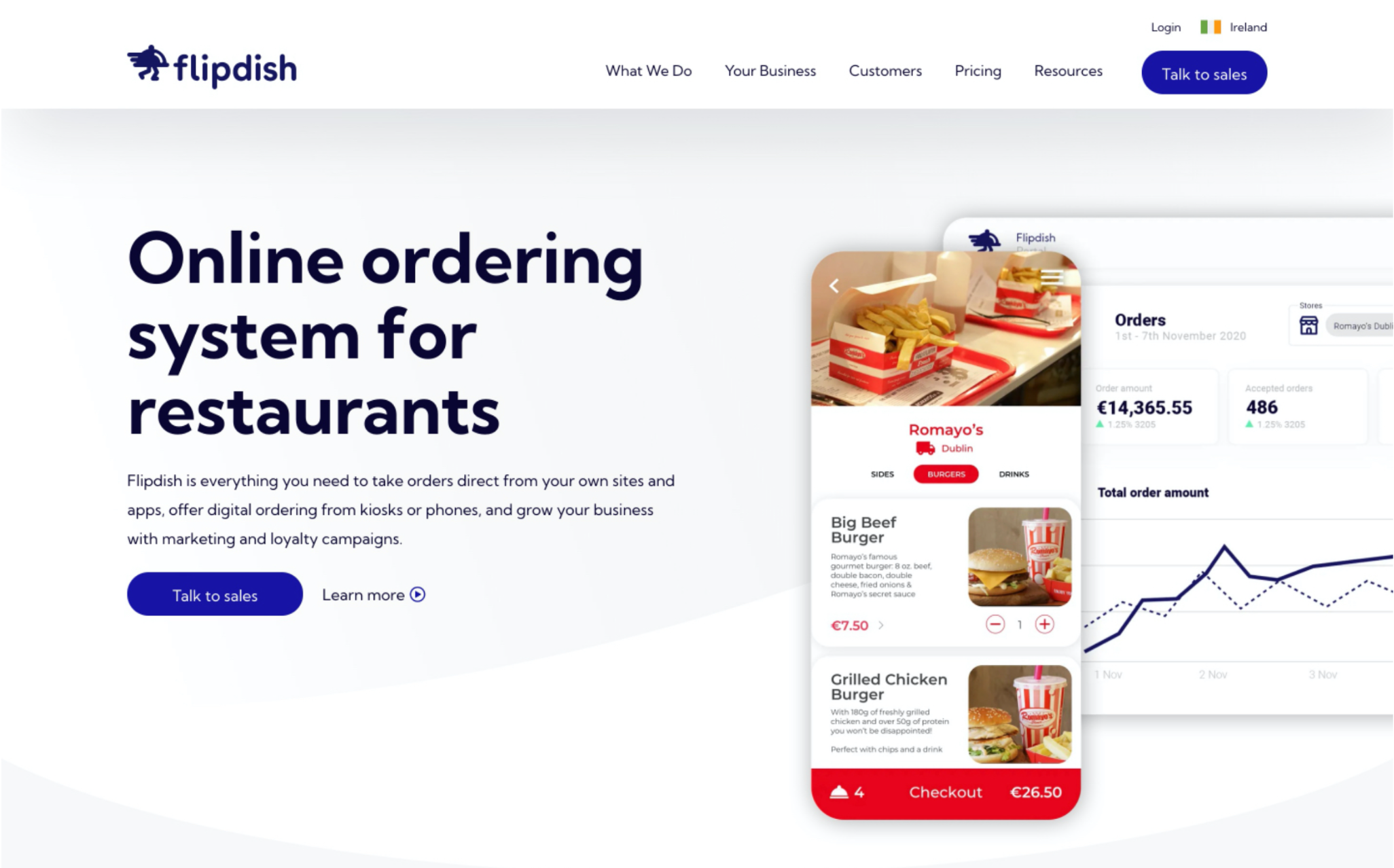
And negative space doesn’t have to be completely white either. It’s simply empty space (that could be patterned or another colour) that makes way for other elements to be highlighted. Take Actavo, whose priority was to highlight their team environment in a quick and snappy way.
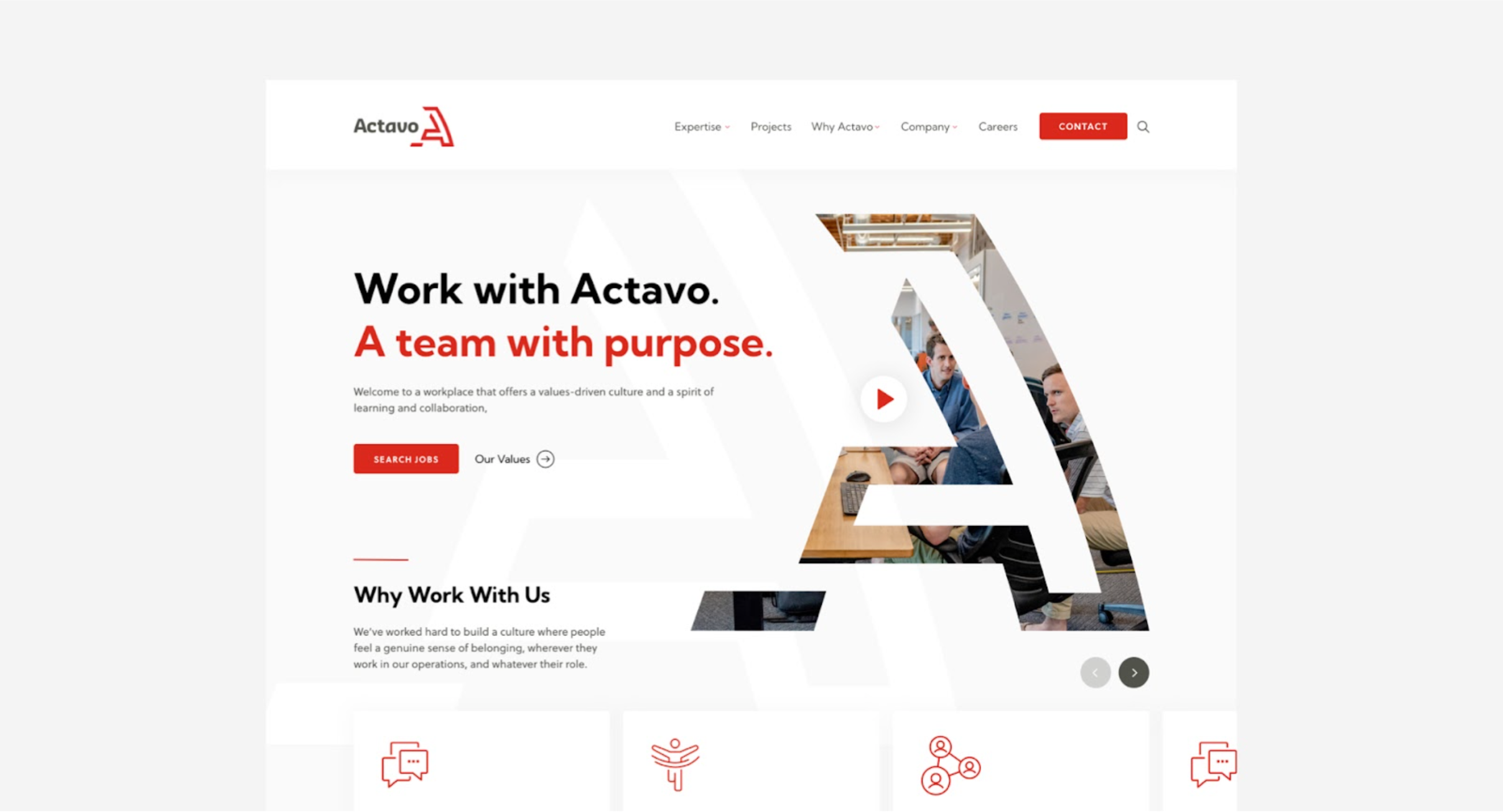
With the bold statement isolated in negative space, the banner conveys the message instantly. They’re a team with a purpose – the user gets the brand message within seconds of landing on the page. If the priority is to highlight important copy and content, negative space is an excellent way to improve readability and get the point across.
The power of visuals
Not only are humans more likely to remember images over words, but we process images 60,000 times faster than text. So I guess a picture really is worth a thousand words. Or six thousand in this case? Either way, it’s crucial that imagery plays a role in your content overall. It could be the deciding factor between whether your site is remembered or not.
Imagery holds power because it balances the line between abstract and tangible. One of Steve Jobs’ secrets to success was emphasising the importance of the visual. Yes, Apple products have one of the most impressive processing systems the world has ever seen. But it’s the sleek, aesthetic iPhone imagery that helps us imagine what that power and sophistication really looks like.
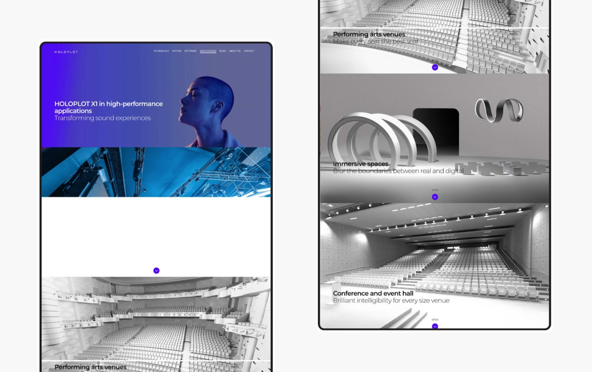
Visuals can even help depict different senses through a screen. HOLOPLOT, a pro audio technology, came to us for help with a unique challenge: how do we visually capture the experience of sound? We understood that HOLOPLOT’s audio solutions are extremely immersive; they weren’t just promoting their audio equipment, but the experience of HOLOPLOT’s sound quality. So we took the approach of focusing on the product itself and what it can do. It can bend the air waves. It can take you places real and imagined. By combining visuals of the physical product and abstract scenes together we were able to convey the experience of sound through a screen. Pretty cool right?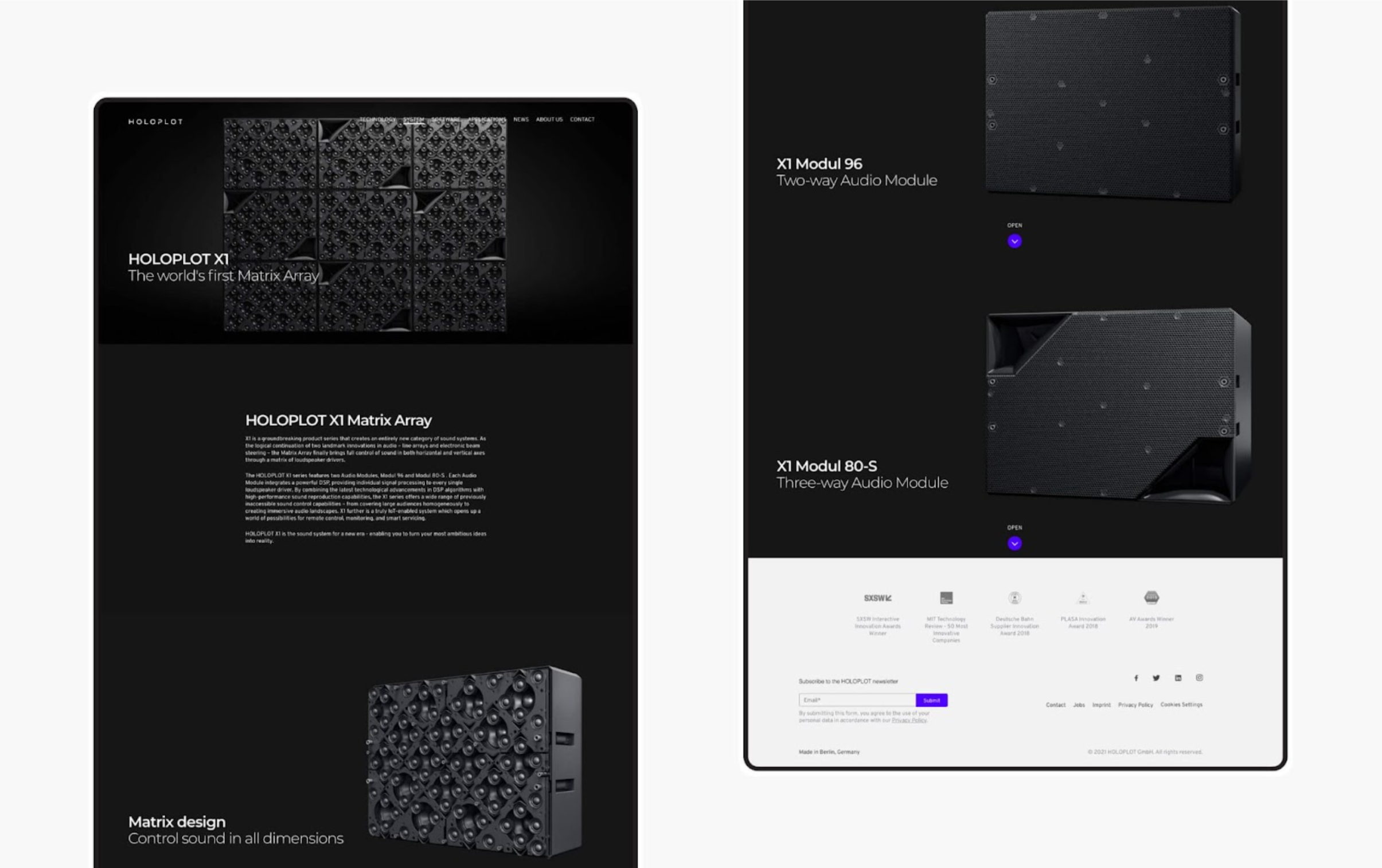
The “F” pattern
The human eye naturally scans information in an “F” shape, starting from the top left to the top right across the upper part of the content area, forming the F’s top bar. Then, it scans a vertical line down the left side of the screen, looking for points of interest. When it finds something interesting, it reads across in a second horizontal movement which usually covers a shorter area. Last, the eye scans the left side in a vertical movement, completing the “F” shape.
Knowing this tendency can help greatly with highlighting certain aspects of your site, and what specifically you want your users to notice and interact with. To leverage the “F” pattern, it suits best to identify broadly what information you want your site visitor to see, and more specifically, what 3-4 aspects you want the user to notice.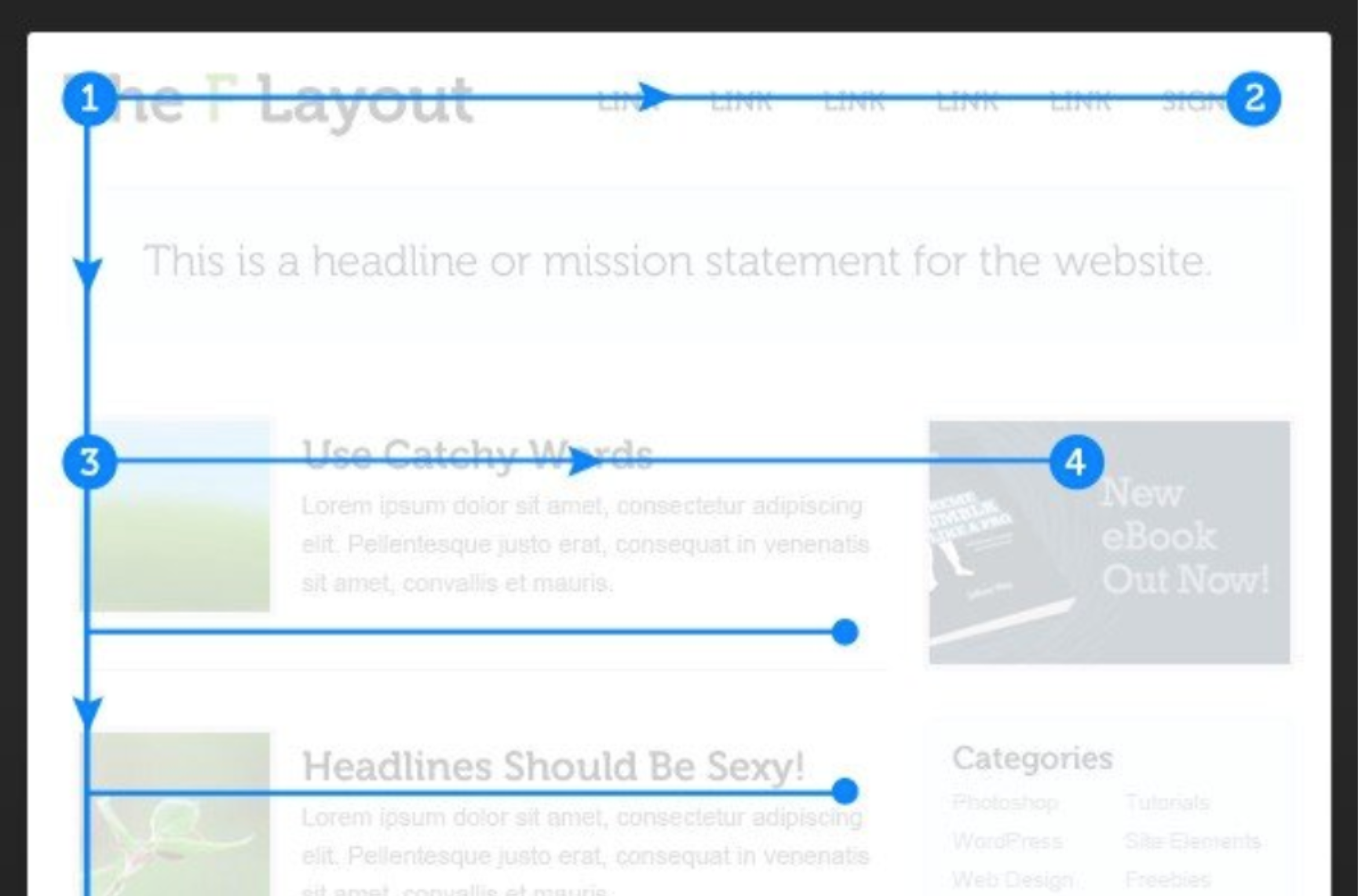
Point 1 is the starting point of the “Z”, and usually a good place for your logo. Then the user will scan across the top of the page to point 2; this is a good place to include your navigation bar. Generally, people will pay most attention to the first and last items on the line, so it’s wise to include your primary or secondary CTA at the extreme right in the navigation bar. Maybe even make it pop with a different colour. Then, add some text for the second line from Point 3 to 4. Last, the ultimate goal is for the stem of the “F” to lead to your primary CTA, the final step.
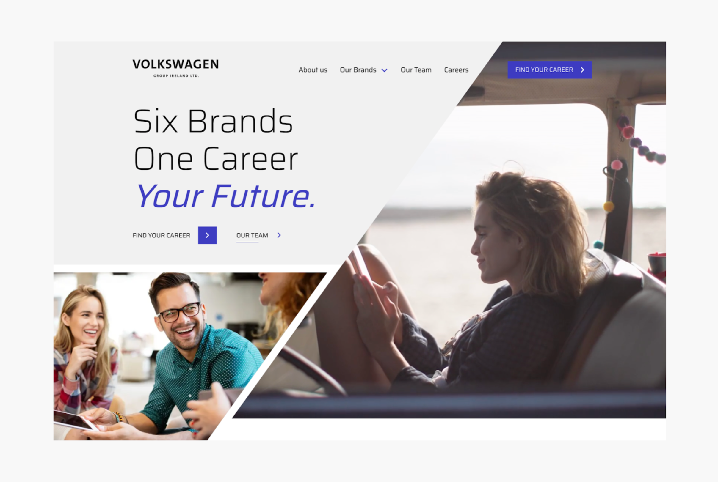
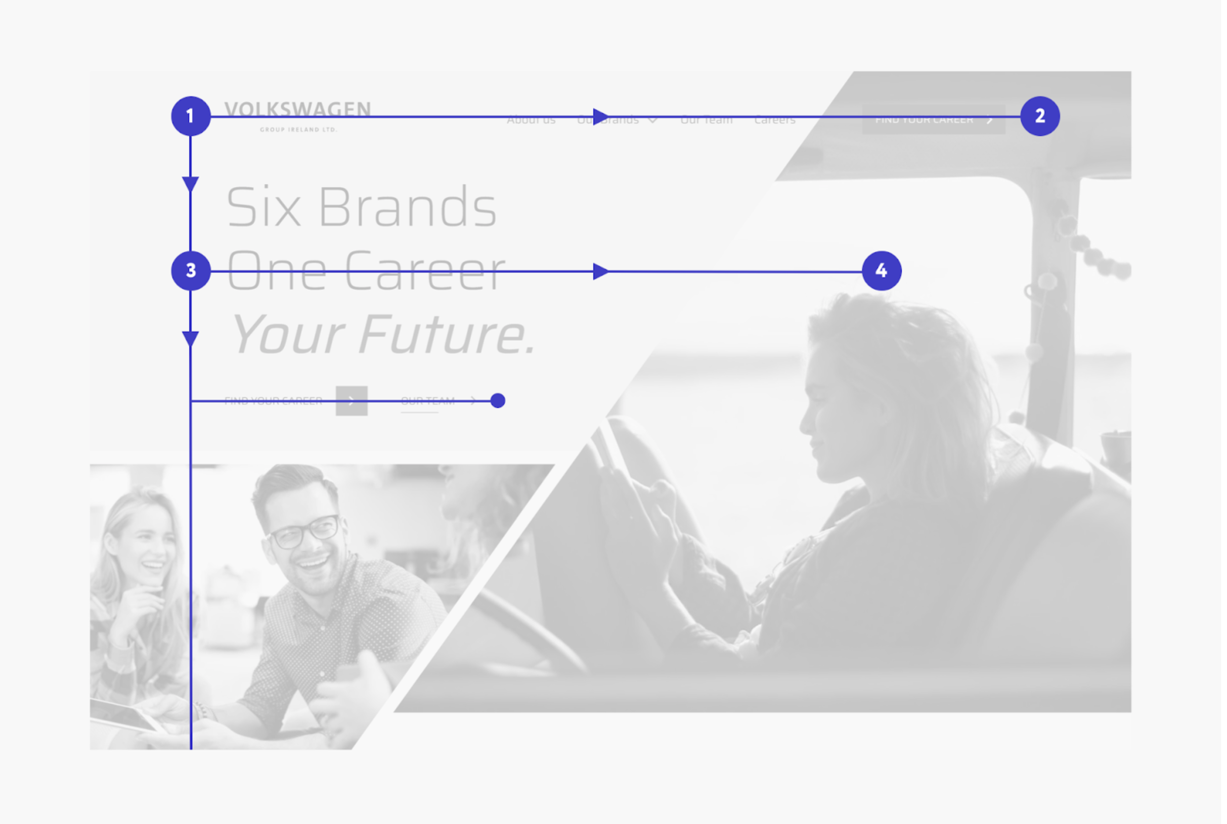
We designed the Volkswagen Careers site to follow the “F” pattern, starting with the logo at the top left. Then the user scans right towards their priority: finding their career. Next, the header text is bold, slightly shorter than the length of the navigation bar, and sets up the purpose of the site. Finally, the user’s eyes land on the ‘Find your career’ CTA, guiding the user to view live job listings. All the important information Volkswagen wanted to highlight falls in the path of the site visitor. Users are probably already scanning your site in an “F” pattern – give them something to land on.
These are but a few of the practices we keep in our digital toolkit; day to day our designers are honing their skills by keeping up with the latest psych findings, their implications, and how we can exercise them in our own projects. Often, our clients approach us wanting to better understand their users – who they are, how they operate, and how to get them to resonate with a digital presence. The time we spend on designing is ultimately rooted in what we learn about human behaviour. We’d love to chat about how to leverage human psychology to elevate your business goals. Get in touch!