


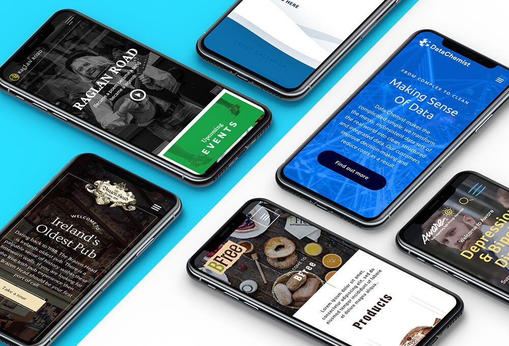

Something interesting happened in 2017 - for the first time the majority of visits to websites were on mobile phones. I say interesting, but it certainly wasn’t surprising, or at least not to those of us who manage to lift our eyes up from our own screen long enough to observe everybody else glued to theirs.
To put this in another, less abstract, way: most people looking at your website are doing so on their phone. Of course this will vary from business to business. In some cases it will be higher, in others lower (and it’s easy to find out via Google Analytics). But whatever the exact numbers, you probably get the idea.
So there’s a very simple reason why mobile-first design matters. The alternative sucks and your customers, readers, prospects etc will end up hating you and your crummy user experience. To make matters worse, Google don’t like sites that aren’t at least mobile friendly, and it’s best not to get on the wrong side of the world’s largest search engine.
Despite all this, and contrary to what most people will tell you, genuine mobile-first design remains thin on the ground. In this sense, mobile-first means designed from the outset to deliver an optimal experience on mobile.
To clarify that, try thinking in terms of positive and negative design. The traditional approach was to design for the desktop and where necessary take things away in order to deliver something that worked on mobile. Mobile-first does things the other way around, designing first for mobile and then considering what might be added on the larger real estate of the desktop.
Not only does this approach tend to deliver stronger mobile experiences, it has the beneficial side effect of forcing the business to make hard decisions about what is really important early in the design process. That cleansing power usually has the effect of making the desktop experience slicker too.
Hopefully you’re bought into mobile-first design by now. Here’s four simple ways to make it work for you.
1. Live it
Next time you’re reviewing potential designs for a new site, landing page, email etc with your agency or internal team, ask too see it on mobile first. I suspect in some cases your agency in particular might make some painful noises - it’s hard to wow the client with your 27 inch iMac display if you’re being asked to show mobile screens on it, but then that’s the point.
Even better, ask to see initial designs on a phone. Taking this approach means you’ll be getting closer to how the end user will actually experience the work, and you’ll be doing so without having been dazzled by the ‘full’ desktop experience already. Your first impression will be more helpful as a result.
Similarly, when you are launching internally take the same approach. Encourage the entire team and business to think of ‘the website’ as what appears on mobile rather than desktop. Once you’ve made that happen everything else becomes much easier.
2. Simplify
It doesn’t take a genius to realise there isn’t as much space on a mobile screen as there is on the desktop. But as I hinted above, that can be a blessing in disguise. Mobile-first design requires us to develop an almost obsessive focus on task analysis so that we can effectively strip away what does not matter and focus on what does.
That process will be beneficial in every channel, but in mobile it is essential. Be aware that in some cases a task may be started on mobile and completed on desktop (or vice versa) - but don’t assume that has to be the case. It may be the case that users tell you that they don’t complete purchases on mobile - but that might just be because your mobile interface isn’t good enough.
When you have a clear idea of what users actually want and need to do, you can design accordingly. Your mobile experience will be intuitive - and fast - as a result.
3. Go native
This might sound blindingly obvious, but it is a subtlety that remains lost on some web designers: we interact differently with the smartphone screen to the desktop. We use our fingers to scroll, click, type - not a mouse and keyboard. And that makes a big difference.
Sometimes that works against the user. Try to minimise the requirement to type, for example, by reducing the number of open entry fields in forms. It’s just that little bit tougher to type on mobile, or at least it is for those of us over 15 years old. Similarly, make sure there is sufficient separation between clickable areas so you’re building in tolerance for the fat-fingered user.
In other areas, however, we should innovate and deliver mobile-only experiences that make the most of the advantages of mobile. This is an example of true mobile-first thinking. Swiping has no direct equivalent on desktop, but on mobile it is a natural gesture that users are familiar with. If it works, use it. You can worry about how to emulate on desktop later.
4. Divide and conquer
First impressions count. You don’t have a huge amount of real estate. Solution: build more than one ‘home page’. That’s effectively the inarguable logic behind building out a suite of landing pages to ensure you are delivering just the right message to the right person on mobile.
Let’s say you are a software company with two products: a word processor and a spreadsheet (forgive the time travel back to 1989 but it just makes things easier). Yes, you’ll have a core website, but doesn’t it also make sense to have two separate ‘home’ pages for those who clicked on ads for ‘spreadsheets’ and ‘word processors’ respectively?
If you have a lot to say, and a limited amount of space to say it in, then think carefully about how you can split your audience by ‘acquisition source’ and display information that is specific to users coming from those sources. As users move to mobile, it helps to think of your ‘website’ as a suite of pages offering a variety of ways in and a custom experience depending on what you know each arrival is likely to be interested in.
You only have a certain amount of time - particularly in an ‘interruption-rich’ channel like mobile. Use it wisely.