
Times change. Some of us are old enough to remember when animation on websites excited us simply because it was possible. In those glory days of animated gifs and Java applets every site on the web felt like an all singing, all dancing circus act. Some even had the music to go with it.
Nowadays we tend to be (rightly) suspicious of animation on websites. We are in an age of clean lines, restrained design and “less is more”.
But animation on websites still has a place.
It may not always be as in your face as in previous times, but used well it can improve both the impact and usability of your site. Let’s talk first about when to use animation, and then how to use it.
When to use animation
If you want a general rule, the answer to the question above would be “sparingly”. But thankfully we can be more specific than that. The following represent situations where some form of animation might be appropriate.
- When we want to draw attention to something. The human eye is sensitive to motion. To be more precise, the human eye is sensitive to salience, which a fancy word for ‘standing out’. So if there’s something on the page we want to draw attention to, motion can make that happen. Do remember though, that when everything stands out, nothing stands out. Be careful not to use animation indiscriminately.
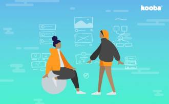
- When we want to highlight clickable areas, or prompt users. Perhaps a subset of the above, but worth calling out. We don’t see many conventional hyperlinks any more, but we still need to let people know when an area is clickable. A simple interaction can do that. As an example, look at the subtle interactions on our “Getting Here” page for Aviva Stadium.
- When we need to make the most of available space. Real estate is limited - particularly on mobile and laptop screens. Great animation can enable multiple messages to be shown within a single area. Back at the Aviva site, the toggling between various entrance routes to the stadium illustrates this approach.
- When we want to give feedback. Animations can let the user know that a process is in motion. We’re used to this concept from the desktop (think spinning wheels of one description or another). On the web, animated transitions from one page to another let the user know something is happening (and give them something nice to look at as they wait)
- When we want to impress. It isn’t a crime to want to make a splash. We’ll talk below about doing so responsibly, but we should never entirely ignore the impact that really stunning animation can deliver. Even at a smaller scale, the satisfaction that animations can give users should not be discounted either. These days we tend to prioritise the ‘scientific’ feedback we get from usability testing - but track and acknowledge unprompted verbalisations of delight in the way design responds to user action. It still matters.
There are other occasions when you may wish to use animation of course. This is just a short list of some of the areas in which it can be appropriate. But animation - like almost anything else - can be counterproductive if used poorly or in the wrong way.
Let’s have a look at how to avoid that.
How to use animation
There are no hard and fast rules of course. What works in one context can be disastrous in another. But there are certain principles and processes that can help ensure your online animations do the job they were designed to do.
Follow these and you should end up with something that is both beautiful and effective:
- Remember: less is more. As we noted above, if we highlight everything, we highlight nothing. In fact, as a rule I would “default to no” when the question of animation comes up. That doesn’t mean we don’t use animations and interactions within our designs at Kooba. In truth almost every site we deliver includes them. But I always want to know why they are being included. If there isn’t a clear answer, leave them out.
- Embed animation into the design process. Adding animation as an afterthought is both inefficient and likely to produce poor results. Instead, ask what aspects of a site could or should be animated early in the process. Build wireframes with your answers in mind. When embarking on the visual design stage of the project, build images and designs appropriate for animation and that take advantage of the possibilities that animation brings - rather than reverse engineering gimmicky movement onto static images.
- If in doubt, keep animations subtle. The ‘wow’ factor has a place, but all other things being equal subtle animations do the job and deliver a more professional feel than bolder alternatives that are more a scream in the ear than a helping hand. Gentle transitions, parallax animations as the user scrolls, and roll-over interactions are the order of the day.
- Keep usability front of mind. Your users are on your site to do a job. As tempting as it may be, don’t let your animations and effects get in the way of getting that task done. In fact, where possible they should support it. Test carefully to ensure that whatever animations you use aren’t causing unnecessary delays or distracting users who are attempting to complete common tasks.
Lastly, keep learning and keep on top of what is technically possible in the space. Because what is possible keeps changing. The sites of today would have been inconceivable only 10 years ago. The nature of online interaction will surely change completely over the coming decade in precisely the same way.
So when it comes to animations: keep on moving!