
If you were ever to be a fly on the wall in the Kooba studio, you’d be one enlightened fly.
The design team is constantly plugged into the newest design trends, then talking about their findings with one another. And they don’t just chat about the popularity of certain trends– they discuss whether they’re even effective or not. As a marketer, it’s always interesting to hear which of the countless design trends are truly primed for lead generation.
So in a way, I’m a fly on the design wall myself. I’ve got the perfect list for marketers trying to convert.
Here are the Top 5 Design Trends of 2023 to drive conversions on your website: from Kooba’s design team.
1. AI for copy, designs and stock imagery
This is a controversial one, but there is no denying the popularity that AI has received over the past couple months. When it comes to web design, AI can be used for writing copy, generating designs and even creating bespoke stock imagery. And since AI can create fast, it can definitely speed up your workflow. Quicker creation time = more users = more revenue. So we’ll definitely be seeing faster workflows from AI in the following year.
There’s far too much to unpack about the ethics of designing with AI. But in my opinion, there’s one thing my fellow UX / UI designers will always have over AI: empathy for the user. You can tell AI to create a million designs. But it’s the designers themselves that understands what kind of design will resonate with users and generate leads. You can’t replicate that human-touch.

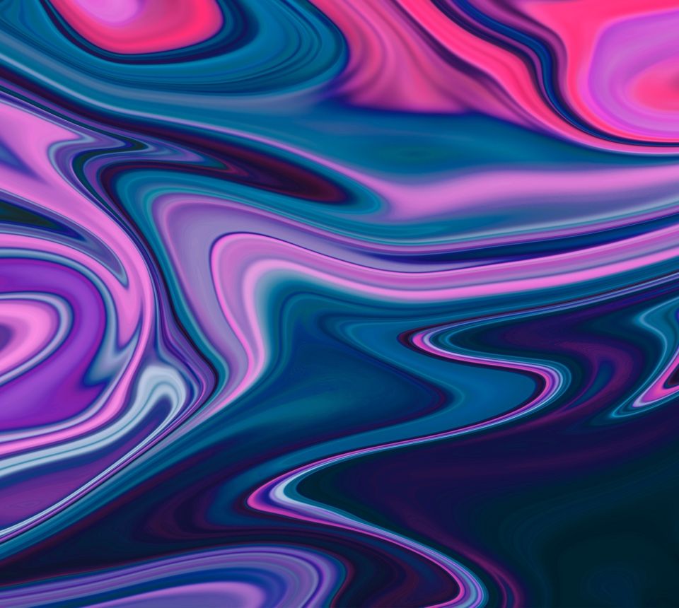
Imagery from StockAI, a website offering only AI-generated images
2. The Y2K aesthetic
I was pleasantly surprised that the aesthetic I grew up on is making a comeback, and that it’s being used as a powerful design rhetoric tool. Referring to the late 1990s and early 2000s, the style is showing up in web design through distinct Y2K elements: bold text, alternative iconography, neon colour palettes and a strong emphasis on the early internet. The trend emerged through nostalgia for the era and a desire to stand out from the minimalist design approaches that dominated web development in recent years.
That’s the magic of nostalgia–the ability to evoke familiarity and longing upon a user’s first visit to a website itself. They may not know you well yet, but at least they know that you’re going to deliver the playfulness and simplicity that they miss. And, it’s a trend that’s here to stay because it transcends target audiences, ‘worshiped by Gen Z and sentimentalized by millennials’. Whether or not you personally like the aesthetic, it’s a sureproof way to build trust, playfulness and rapport with customers right off the bat.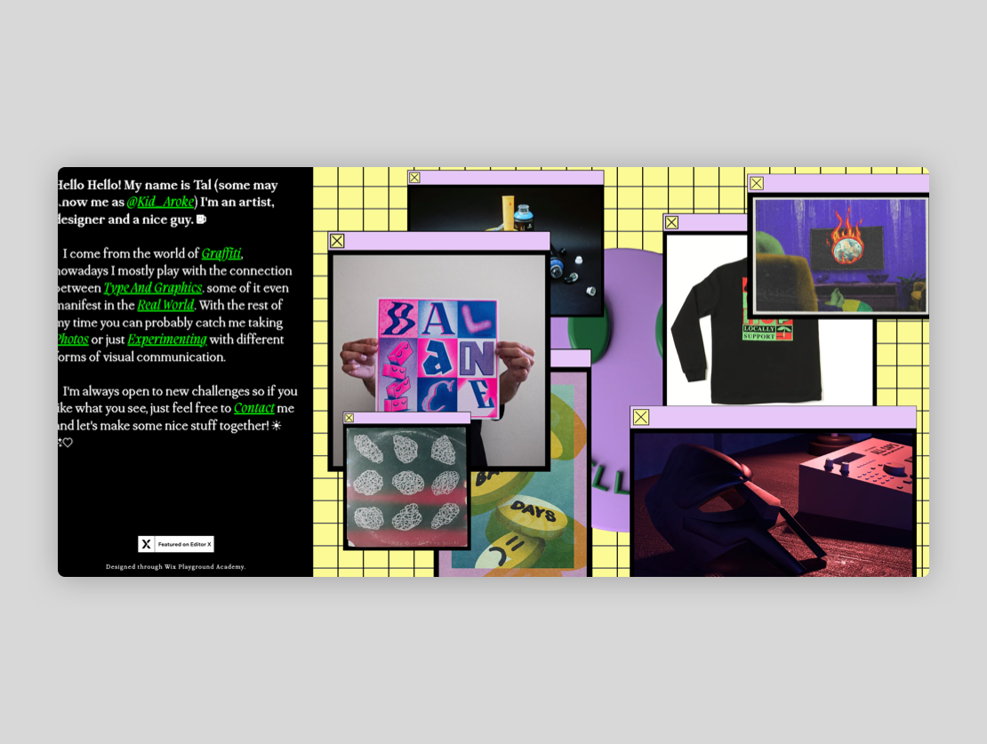
Aroke1 Y2K website design aesthetic
3. Ugly/brutalist design
So ugly is the new beautiful, and what I mean by that cliche statement is that Brutalist web design can actually bring in a remarkable amount of leads. Let me explain.
Brutalism is a ‘transparent style that prioritizes functionality over form, and effectivity over aesthetics. Some web design techniques include solid colour backgrounds, untreated photos and sharp geometric components – and this can be kind of jarring at first. But they’re made to function, and functionality is a key component of the user experience. “Brutalism” comes from the French brut which translates to “raw”, and when done properly in web design can sculpt a site down to its barebone purpose: to generate leads.
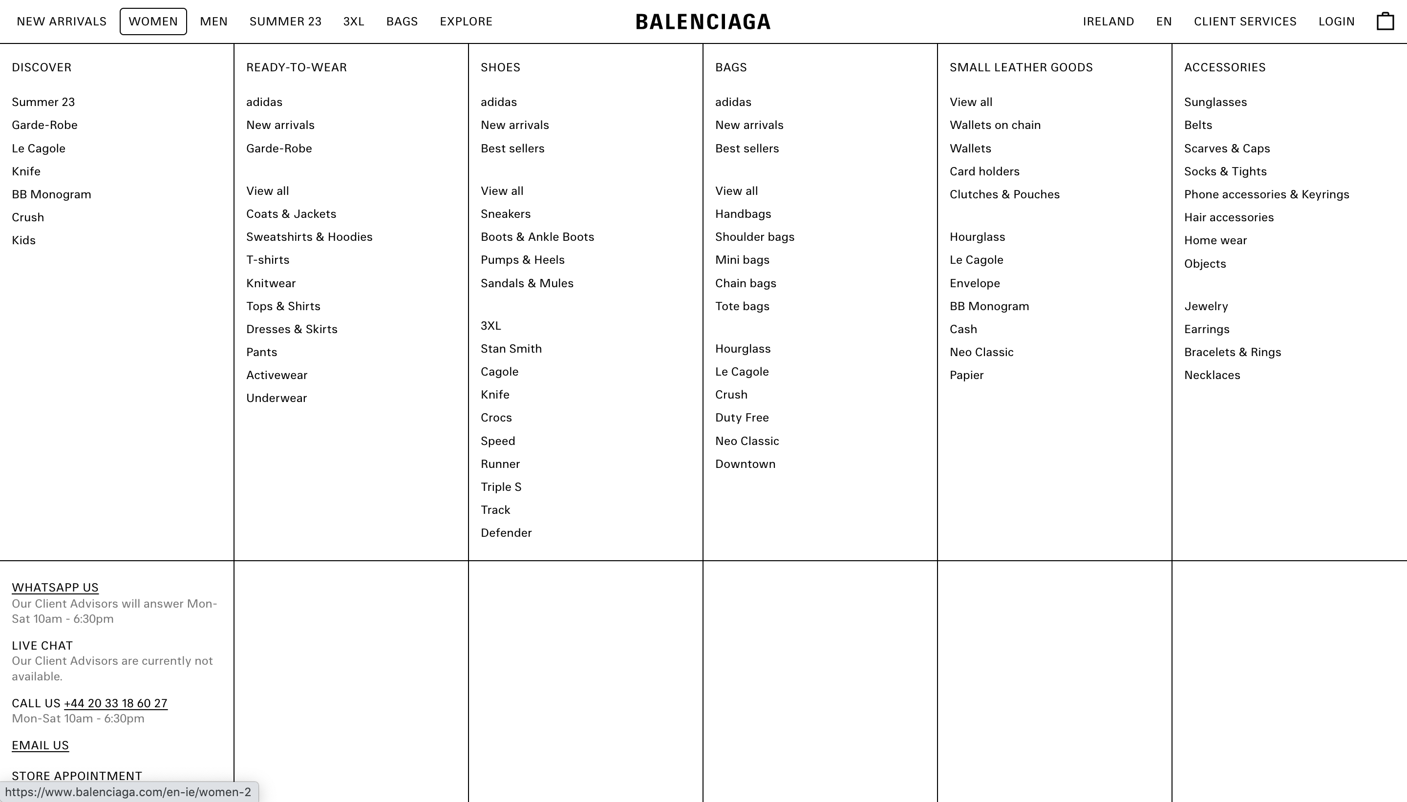
Brutalist website design on Balenciaga.com
4. Scroll effects
This is maybe one of the most popular web design elements this year. So far we’ve seen infinite scrolling, where the user will never reach the bottom of the webpage. We’ve seen left-to-right scrolling rather than the standard up-to-down. They’re unconventional, but that’s the point. Scrolling effects can surprise and engage visitors, and this curiosity ultimately encourages users to keep scrolling. Which is really what you want right, right?
A scroll is ultimately a user’s vehicle to get around a website, and making the vehicle itself interesting will make them want to take it for a spin. If your scroll is engaging (and your content is too), this is a great tactic for conversion. 
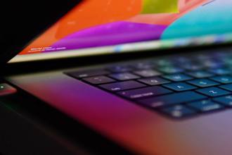
5. 3D visual assets
This is a big one, as immersive experiences are really big in web design right now. 3D assets are a great opportunity to display products while also communicating to a potential customer that you have a sophisticated digital presence.
3D assets are a relatively new innovation in web design, so if a user sees them, they’re likely to be pretty impressed by your business and potential capabilities. We’re visual beings, and now digital beings too. That means we’re led by what we see, and we’re seeing content all the time. 3D visual assets are a perfect way to make a digital experience memorable, and ultimately, convincing.
So there you have it, a little preview into the #designdesk Slack channel, and the discussions our team has surrounding design trends and seeing results. It’s not necessary to overkill your website with all of these trends, but they’re definitely popular for a reason. These ones especially have stood the test of time and played out positively for our clients and their KPIs.
Get in touch if you’re interested in updating your website design in a way that will strengthen your business’s digital presence.