

For many organisations, the form is the single most important interaction on their website.
Consider the following examples:
- A Saas company looking to collect personal details in exchange for free content
- A retailer collecting information required for a first purchase
- A booking engine requesting details to confirm registration
In every instance, the percentage of people who complete the form after starting it is of vital importance to the business. Expanding on the first example alone (which we have plenty of experience with), improving completion rate by just 10% can have major impacts on the amount of new business generated by paid media campaigns. And forms play a major, major part in that.
But what does an effective form look like? That is a hard question to answer, because every individual situation is unique. But over the years, we’ve learned a few things and we believe following the ‘six secrets’ below will pay dividends.
They range from general principles to follow, to more specific advice - of which there is an almost limitless amount out there. Pay heed to all six and you should see a real impact on your business.
Secret 1: build bespoke forms for each use case
It can be very tempting to build one ‘standard’ form and use it across the board. And this temptation is only exacerbated by marketing automation software that enables forms to be saved and re-used across multiple landing pages.
Resist it. Design each form, using some of the advice below, to meet the specific requirements you have in any given situation. For example, if you are asking a visitor to sign up for a newsletter, just an email is usually enough. It gets the job done and can be submitted on the spur of the moment.
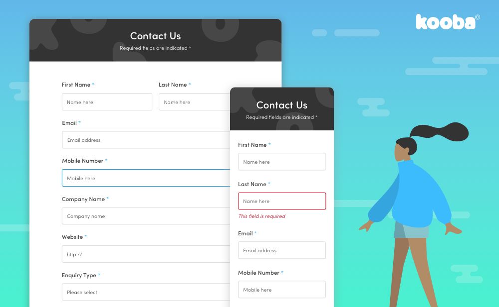
On the other hand, when designing a ‘Contact Us’ form provide plenty of opportunity for your potential customer to explain what they want and how you can help. Some amount of intent is already implied once the customer reaches out, so it is safer to request greater levels of information.
Secret 2: don’t make your problems their problems
If we store Firstname and Lastname separately in our database, it probably makes sense to ask users to input those values separately. Along the same lines, it would be fantastically convenient to ask users to confirm their email address so that we can be absolutely sure we have the right one.
We’ve probably all been in conversations like these, and they are almost always conducted with one person missing: the user themselves. That’s why it is vitally important that somebody speaks up for them That person is you.
Never, ever, make the easy decision to transfer your problems onto the user. In a vanishingly small number of cases the user will understand that confirming their email address is a good idea. Go ahead and ask. But if you are just hoping for more accurate email marketing, forget it (there’s no guarantee of accuracy anyway - ever hear of cut and paste?).
Asking users to work to fill in forms reduces completion rate and hurts you in the long run. Don’t do it.
Secret 3: all other things being equal, as few fields as possible
It’s just a fact that the more fields required, and the more intimidating a form looks as a result, the less completions you are likely to see.
That doesn’t mean that fewer fields are always preferable. It does mean that your default setting should be one field, and you add others only if they feel absolutely essential.
Again, you must make hard decisions here to avoid the user making the easy decision later. Do remember, however, that in some circumstances more really is more.
If it is particularly important to establish real intent by asking for company details and a phone number, by all means do it - but consider making those fields optional, and clearly mark them as such.
Secret 4: make feedback helpful (or avoid the need for it all together)
We all make mistakes, and that certainly applies when we are filling in forms online. When it happens, make sure the feedback messages delivered are as helpful and timely as possible.
The wrong approach is to allow the user to complete the entire form and then, when something is wrong, deliver a vague error message that makes it unclear how to fix the problem.
A classic example would be “email is invalid”, which leaves the user scrambling to find the email field and then attempting to figure out what precisely it is that makes their initial attempt ‘invalid’ in the first place. When giving feedback, do it as soon as a user tabs off a field, and let the user know precisely how to fix the issue.
Better yet, provide in-line help and placeholder text to show them how to get it right in the first place. Remove the need for feedback messages (but still have them just in case!)
Secret 5: think mobile
It is most important that form design remembers the existence of mobile and the fact that over 50% of all global web traffic is on mobile.
This isn’t just a case of responsive design, although of course that matters. It is that form designers must consider the very different interaction methods that dominate on mobile.
One obvious example: keep typing to a minimum. Adept as the younger generations are with the mobile keyboard, typing is still inconvenient. Where possible don’t use drop downs as these can cause issues on mobile screens. Ensure the submit button is ‘under the thumb’ when a form is displayed on mobile.
But remember it isn’t all bad news. “Native mobile” interactions can help make forms faster and easier to complete. Sliders for indicating ranges are one good example that works well in both mobile and desktop sites.
Secret 6: innovate and test!
What is a form? That might sound like an esoteric question, but by asking it we can open up new possibilities.
If we wish to collect important data from a site visitor, are there other ways to do it?
We built a ‘chatbot’ style form for one client that asked questions sequentially, as if coming from a ‘real person’ on the other side of the screen. The result was a 400% increase in conversion.
There are alternatives to the form, and alternative ways to present the same forms. Questions can be split across more than one screen, or all contained within one long page. Some can be removed or re-phrased. The choices are endless.
Fortunately landing pages usually allow us to adopt and test competing approaches, and establish what truly works when it comes to real users. Make the most of that opportunity, but one final note: don’t measure success on completions alone. Instead look at valuable completions (however you choose to define the word ‘valuable’)