
How do you create a visual experience that not only achieves the highest standards of accessibility, but also delivers a truly enjoyable experience for every user?
This was a question we became obsessed with in our recent work with Nexus Inclusion, for whom accessibility needed to not only work seamlessly, but also look visually appealing and exciting. After all, is a digital experience truly inclusive if disabled users cannot actually enjoy interacting with it?
Accessible and enjoyable
As we like to say at Kooba, good design is accessible design. Accessibility can often be reduced to compliance checklists, but our collaboration with Nexus Inclusion went far beyond that. For Nexus, every element of design was considered not just for functionality but for the sense of independence and clarity it could provide the end user. By embedding inclusion into the foundations of the interface, the result was an experience that is equitable, intuitive, and engaging.
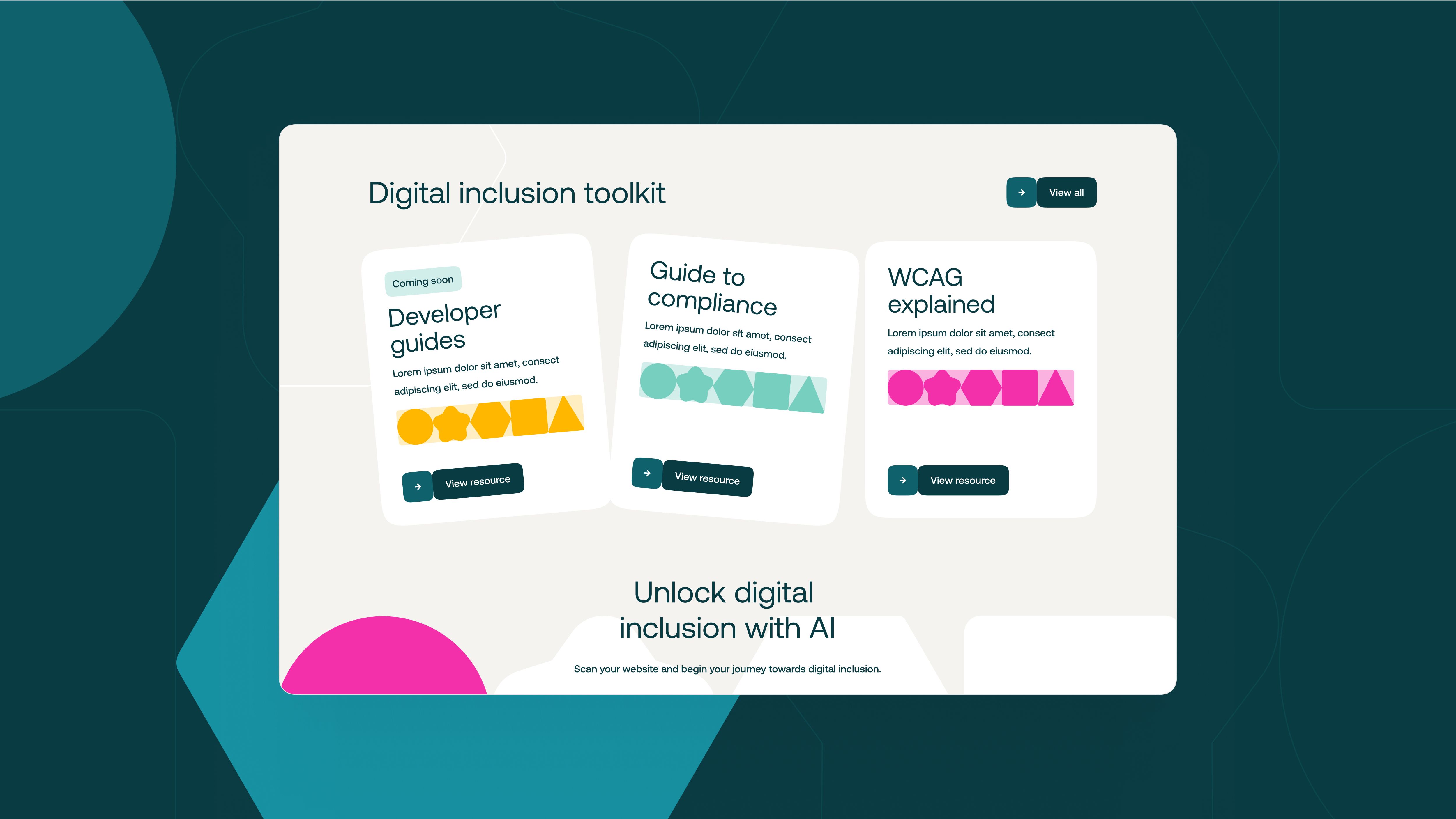
This is most obvious with the building blocks of the Nexus visual brand. By using a high-contrast palette, distinct shapes, and strong movement patterns, we were able to deliver a brand experience that was both highly accessible and super engaging.
Motion and animation
With the right strategies, motion, interaction, and accessibility can all co-exist and reinforce one another. For Nexus, animations were used with intention, adding value without overwhelming or excluding. For users who benefit from visual cues, the incorporation of motion helped to highlight key interactions, provide feedback, and guide navigation. For those who prefer minimal movement, controls and reduced-motion options were seamlessly built in. This balance meant the design could feel alive and expressive, while still honouring individual accessibility needs.
Technical infrastructure
Of course, to “have our cake and eat it too” required a range of creative development solutions. The technical infrastructure had to meet the highest standards, supporting screen readers, ensuring keyboard navigation, and delivering precise colour contrast. Nexus Inclusion’s platform is built to test, monitor, and continuously improve accessibility, and our design process mirrored this ethos. We treated accessibility not as an afterthought but as a fundamental building block of the site’s architecture, ensuring resilience, scalability, and long-term compliance.
Loud and proud
Beyond the website itself, Nexus Inclusion needed a brand presence that would reflect their mission and values across every channel. We developed a complete marketing package that included digital assets, motion design, and communication guidelines, all aligned with the same inclusive principles. By unifying accessibility with compelling visual storytelling, the brand was able to present itself with confidence, professionalism, and clarity, all while staying true to its mission of inclusion.
Conclusion
Working with Nexus Inclusion demonstrated that accessibility and beauty are not mutually exclusive, but deeply connected. The result was a digital presence that reflects both the company’s innovative approach and its unwavering commitment to inclusion. Together, we created a platform that is not only compliant but genuinely enjoyable to use, showing what is possible when accessibility is treated as the foundation of great design.
To read more about Kooba’s work with Nexus Inclusion, check out our full case study.