


To create website experiences that visitors keep in mind, good usability is very important. Websites need to enable the user to know intuitively what they need to do to successfully reach a certain goal and enjoy the journey getting there. One very important aspect that comes along with this is responsive design. IT helps to make it possible that the user can find what he needs immediately and gets a good feeling about the company presented by the website and its content. Living in a time where most people keep their mobile devices handy all of the time we need to develop internet solutions that match the different browser widths on all the devices used by potential users.
To do so our team at Kooba Internet Solutions Ltd. creates at least three different designs — one for mobile phones, one for tablets and one for desktop computers. Each design is optimised for its respectice device and for the width the browser window has on this device. On desktop browsers there is a lot of space to show all information that is needed at once in a neatly arranged and attractive way whereas on mobile browsers there is limited space. Consequently we need to position elements in a space saving way. On mobile devices the most important information is shown at the first glance whereas less important information, such as the menu, is hidden first and can be accessed whenever it is needed. In addition the font size also has to be adjusted to the browser width on each device. Having limited space on mobile devices we have to display the text in a smaller font, which has to be big enough to make it possible to show a lot of information on the one hand, but on the other hand ensure that the user can read all information easily. Because of the different browser window widths across devices, we can also use bigger spaces in the desktop version than we can do in the mobile equivalent.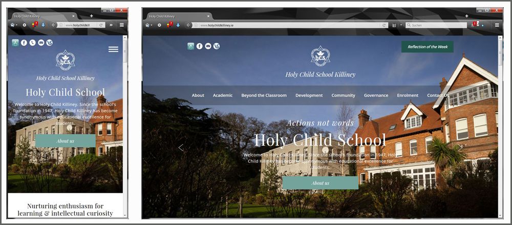
To optimize the usage of the available space across different devices, we also use different positioning of elements on mobile devices. Having content related images next to the related text on the desktop version of our websites, images and text are aligned underneath each other on the mobile version. Another example for the different positioning are the menu list elements which are next to each other on desktop versions — but underneath each other on mobile versions.
To allow the users a great experience on our websites we also have the image sizes adjusting themselves to the browser window width by using percentages for the image widths to get good quality full-width images. To enable website content to fit the entire browser window width we also use percentages for spaces (e.g. horizontal paddings and margins) to let them stretch to full width when the browser window size is changed.
Applying all of these different styles is possible by working with media queries which allow us to automatically select the different styles prepared in CSS dependent on the browser window widths. At a minimal width of 320 pixels the styles for the mobile phone version are selected. When the browser window is at least 760 pixels in width the tablet styles are applied. For a browser window width of at least 1000 pixels the desktop styles are displayed to the user of the website. As such the users of our websites get a memorable experience optimised for their device.