

No matter what business you’re in, people need to find you. Yes, the internet is a wonderful thing, but sooner or later there comes a time when face-to-face is required. Of course for some of us that comes sooner rather than later. If you’re in the hotel, restaurant, entertainment or retail business you want people to be able to find you - and find you easily.
That process, getting to the destination, is part of the user experience. And whether it’s fair or not, you bear some of the responsibility for that journey. With that in mind, it’s important to present location information as clearly and helpfully as possible.
Here’s four ways to make that happen:
1. Customise the map
This might feel blindingly obvious, but is a (golden) rule still more honoured in the breach than the observance. Google Maps is of course almost the only game in town when it comes to delivering online location maps, but Google’s brand identity isn’t your own brand identity. In all cases take the time to customise the appearance of any map onsite, so that it is not just beautiful but also in keeping with your brand identity.
We worked recently with Raglan Road, an Irish bar and restaurant in Florida. Their map styling and contact information fits well with the look and feel of the page, is clear and impactful. Get the basics right.
2. Allow the user to filter locations
If you have many outlets, or venues (or whatever), don’t impose additional mental load on the user by demanding they pick their way through a map congested with pins. Wherever possible, allow the map to be customised and filtered to only show venues of a specific type at any one time.
The example below from the Irish Film Board (another Kooba project) demonstrates how this can be done. The requirement is to show a number of types of locations on a map. In terms of user experience, it makes no sense to create multiple maps as the same user persona may wish to browse all these location types. At the same time, showing all these locations simultaneously is overkill - and confusing overkill at that.
The solution is simple - enable the user to edit the map themselves and see only what they wish to see. Using the nav to the right on the illustration shown, users select the location type they are interested in and can then use the images on the right to find each specific location on the map. Simple, but effective.
3. Take advantage of the lser’s location (and Google maps directions)
A simple trick that is seldom implemented. In an age where being aware of the user’s location is pretty much default, it’s easy to not just show location on-site, but also to show how to get there. And not just how to to get there, but how the individual can get there from where they are right now!
We implemented this approach on our recently launched Aviva Stadium website.
A very simple workflow asks the user how they are hoping to travel to the stadium, and based on this response a new Google Maps window is opened with actual directions and timings to get to the stadium from the user’s current location. Of course once in that experience the user can then tailor it to suit any specific requirements around departure time or indeed travel from another location.
A great example of how focusing on the users ‘job to be done’ (in this case - get to the Aviva Stadium) can mean doing things a little differently.
4. Go beyond Google when you need to
Google Maps is a powerful tool, there’s no question about that. But it can’t do everything. I’m sure we’re all familiar with the experience of arriving at our location only to discover we can’t figure out exactly how to get in - or where to go when we do.
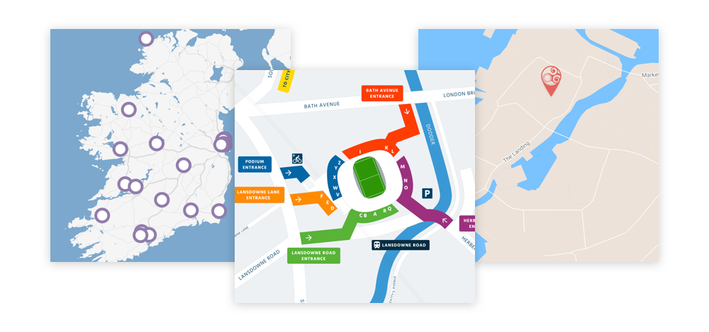
Addressing precisely that type of challenge was another core aspect of our work with the Aviva Stadium. In the context of a stadium there are multiple approach routes, multiple entry points and thousands of seats. Getting the individual ticket holder to the right place is complex, and managing crowds and confusion on the day is an expensive (and in some cases even dangerous) option.
With that in mind we designed an online experience that worked with the Aviva Stadium’s colour-coded ticket system to show as clearly as possible exactly how to approach the stadium and get to the seat.
We created a bespoke map for this challenge - we had no real choice in the matter, as at this level of granularity the alternatives aren’t really an option. However, that decision enabled us to design for maximum clarity and impact. The user simply selects the colour of their ticket (green in the example above) and we provide a clear route into the stadium. On the left, instructions around arriving at the stadium specific to that ticket colour ensure that crowds approach from the correct direction - or at least know how to!
Ultimately, when using maps online keep in mind the core question: what is the user trying to do? Design in response to that question and you’ll be making sure the journey to your business is just as enjoyable as the experience when you get there!