

There are differing opinions on what elements a landing page should and should not contain and how these elements should guide the user. A landing page is typically used to convert site visits into user input, e.g. submitting a form or purchasing a product/service. As every landing page has its own particular aim, there’s no single solution to the optimal design of such pages, however, there are certain guidelines which your landing page should follow if you’d like to keep the user focussed on the goal of the page. The following article is a rough guide to designing the best landing page for your case at hand with an emphasis on keeping the user in focus with the aim of the page.
Headings
A clear and concise heading should show relevance and also engage the visitor to scan down the page.
Content
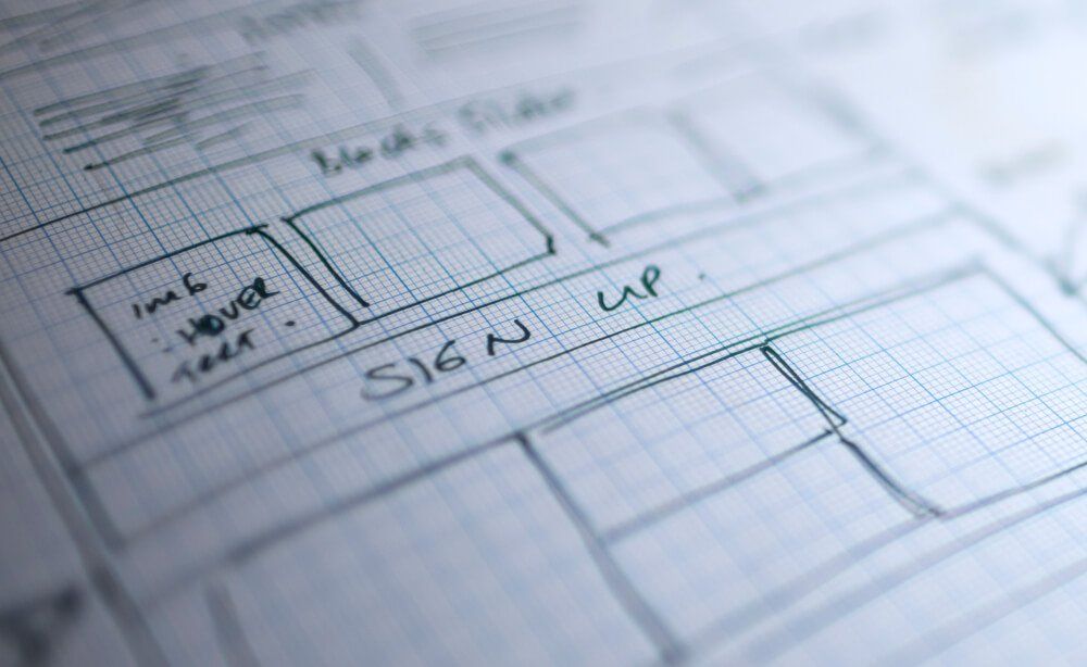
Before you start designing a landing page, you should ask yourself a very simple question that will help you focus your design.
What is the purpose of the page?
Is it to get users to sign up to a newsletter? Or to register their online profile? Or maybe even to promote the company’s mission, products etc..? Visitors know why they’re on your website and expect a clear path to getting what they want. A clear purpose will Instantly show relevance and help visitors achieve the intended goal, whatever that may be.
In the example below, version B increased sales by 41%. Condensed copy and a more minimalistic design has worked in this example.
Navigation
Removing menu options has been shown to increase conversion rates as there are fewer areas on which users can click and they are immediately focused on the intended aim of the page , e.g. call-to-action, registration form. Research has indicated that streamlining your design by removing the navigation bar can result in 100% conversion rates.
In the following example, completely removing the navigation menu increased the conversion rate by 100%.
Simplicity
Decreasing links and minimising distraction in order to increase user attention to the goal of the page can increase click-throughs remarkably. Below are example templates of a test performed on simplifying landing pages.
Decreasing the verbosity of the heading and breaking up content into simpler bites increased signups by 91%.
Key messages
Other key “relevance messages” should be readily scannable through choosing the right headlines.
User journey
The design should make the next step clear to the user and minimise the number of clicks required for response. Keep in mind the following when creating your user journey:
- Every extra click required will reduce response by 10%.
- If requesting user data, avoid click-throughs and do this directly on the landing page.
Page length
The page length minimises the knowledge gap between what the user wants to know and what you tell them. Tests show that users will scroll if the page appears scrollable, however, it is best if key information is visible on page load. Tests have shown that longer landing pages in which the navigation has been omitted can generate up to 220% more leads than above the fold call-to-action. However there's no hard and fast rule with regards to page length.
In the above test performed by Basecamp, you can see that while a longer page increased signups, but a shorter, more engaging one increased them even more.
Media
Your content images must be consistent with the page intention, while at the same time should not distract the user from the intended goal. It is difficult to assess how graphics influence conversion rate, so the implication is to test.
To summarise, if you keep your content focused on the intent of the page, avoiding the inclusion of additional elements and click-throughs you should see your conversion rate increase significantly.
We hope these findings help you when it comes to designing your landing page.