



We’ve gone from being chained to the wall to carrying the whole world in our back pocket. Mobile technology has evolved dramatically, from the corded landline to the flip phone and from tiny physical keypads to touchscreens. With each iteration of the mobile phone, new ways of interacting with technology have emerged, shaping expectations for day-to-day digital experiences.
Take 2007, for example. BlackBerry defined cellular technology; its physical keyboard, trackball, and mobile email access made the device appealing to business professionals. Its instant messenger system (BBM) maintained popularity among teens and young adults, allowing users to connect through unique PINs and message their friends.
Everyone seemed to be carrying a BlackBerry, with the likes of Paris Hilton even reportedly carrying 5 BlackBerry phones at a time. BlackBerry made mobile connectivity accessible and a facet of everyday routine across a large demographic, monopolising mobile tech. However, Apple’s first iPhone would soon challenge the concept of what that connectivity and routine should look and feel like.
The dawn of the iPhone challenged the existing conventions of mobile interaction. Physical keyboards and trackballs were absent from the sleek design, replaced by a multi-touch interface and a home button. This new design allowed users to navigate, type, zoom, and interact directly with content on screen. The screen no longer acted as a small viewport for visual information, but instead acted as the primary interface.
While BlackBerry users had access to the web on their devices, the smaller viewport and trackball navigation made browsing awkward and time-consuming. Now, with a much bigger screen, heightened levels of interaction, and the mobile Safari browser, web browsing could feel more intuitive and streamlined, reshaping expectations for mobile web experiences.
For designers, this had significant implications. As mobile browsing became increasingly common, site layouts and interactions had to adapt. Initial designs made for desktop screens didn't consider narrower viewports, touch-based interactions, or gesture scrolling. This presented new challenges for web designers: they not only had to ensure a streamlined experience for desktop users, but also cater to audiences increasingly viewing sites on mobile devices.
The answer was responsive web design intended to adapt to different devices, screen types, and sizes. Instead of building separate experiences for mobile and desktop, designers could create flexible layouts that ensured usability across devices by reorganising content and adjusting navigation per screen.
Now, as foldable devices offer further functionality to digital experiences, the question becomes: what effect will this new technology have on the UX design process? The screen is changing the way we interact with a touch screen as well. Is this a BlackBerry repeat? An overhaul of the digital experience?
How do you bring design into the fold?
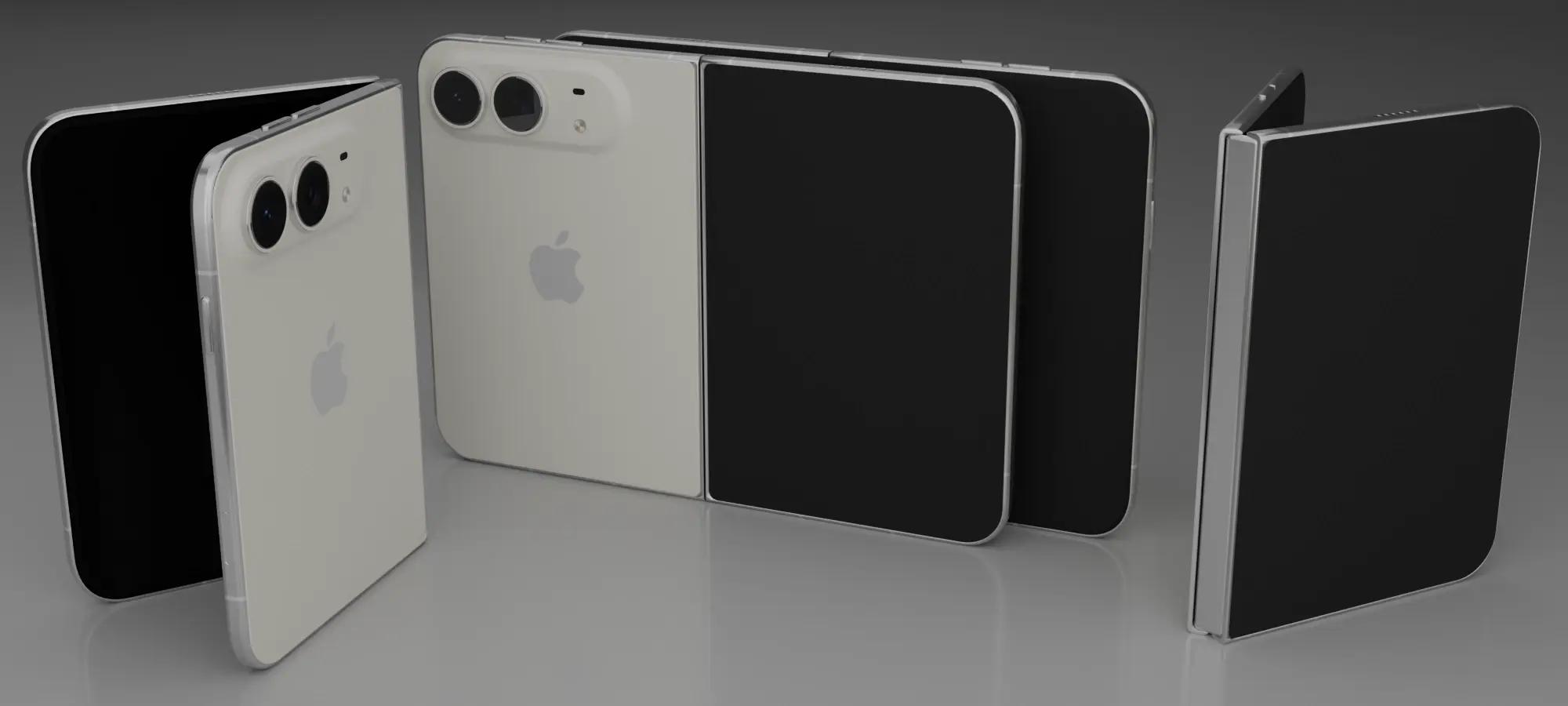
The foldable phone seems like an abstract concept, but it’s one that has already started taking shape in the mobile market. In 2019, Samsung introduced the Galaxy Fold, a phone that allowed its users to transform its display from a compact smartphone to a larger tablet-like screen. Since this first model, Samsung has gone on to release 7 foldable models, and Apple has officially launched its first foldable model, the “iPhone Duo”.
The announcement of the “iPhone Duo” took place in September of this year, with pre-orders in Ireland taking place on the 16th of October. This release now sees two of the world's leading smartphone brands by global shipments invest in foldable technology. While mainstream adoption in the past has been shaped by practical considerations such as price, battery life and durability, the developing investment in foldable tech poses questions: Will foldable phones become the new standard device for mobile use? And what could this mean for the current digital experiences we've come to know?
What does foldable technology mean for UX?
Unlike traditional mobile devices, the foldable phone offers two primary screen configurations: a smaller outer display for common everyday tasks, and a larger inner display that unfolds into a tablet-like screen. These configurations allow users to view larger amounts of content at once, interact with multiple apps simultaneously, and conduct side-by-side comparisons. Additionally, users expect screen continuity, seamlessly continuing an activity between folded and unfolded screens without losing their place. This means preserving elements like scroll position, form inputs and navigation state, ensuring their journey continues seamlessly as the layout adapts.
Historically, a common quick fix for larger viewports was simply stretching layouts and increasing spacing. However, foldable phones bring distinct user behaviours, and designers must recognise that these interactions differ from simply using a larger phone screen. With dynamic form factors, users shift context and intent based on how the device is held. On a folded interface, a user might focus on finding quick info or completing a single task. On an unfolded screen, the additional real estate gives users room to explore details, compare options, or read complex content thoroughly.
However, while a larger unfolded display can support more detailed content, comparisons and multitasking, designers shouldn't assume that changing screen configuration means changing user intent. The priority is to maintain a consistent, intuitive journey while simultaneously adapting the experience to the newly available space.
In terms of UX, this means looking beyond basic viewport fitting and evaluating whether a website supports varied levels of interaction. Whether studying for an exam or searching for a restaurant, foldable usage may involve:
- Using one or two hands to grip your device
- Conducting a singular task or multiple tasks at once
- Moving between portrait and landscape configurations
- Using different points of interaction, depending on how the screen is being held
- Moving from casual browsing to making a considerable decision
Accessibility also remains central to these experiences. As layouts adapt, designers must ensure that the content remains readable, controls stay reachable, and navigation follows a logical order, regardless of screen size, orientation or how the device is held. Each interaction should be dynamic enough to help the user along their journey, while ensuring that changes in screen configuration do not interrupt a user's journey or compromise usability.
What does foldable technology mean for UI?
In optimising your website for a foldable phone, UI & UX designers must understand that implications extend beyond conventional responsive layouts into more specific viewport management, device-specific interaction patterns and content reflow.
UI designers and developers have to consider how Flexbox, CSS Grid, breakpoint logic and fluid typography can reorganise a site’s content as the available viewport changes. Designers should not rely on fixed device dimensions and instead ensure that layouts respond to the space available on a website, letting components change dynamically when arrangements become swamped, or additional spacing creates a usability benefit.
Furthermore, foldable devices can introduce physical considerations such as hinges and screen creases. Apple’s adaptive layout guidance highlights reserved regions to accommodate the iPhone Duo’s hinge, while Android offers similar fold-aware layout principles. Depending on the device and browser, designers may need to account for how these affect content visibility and interaction. For websites, the priority is building flexible layouts that reflow naturally, while considering fold-aware techniques where supported.
So, should your website be ready to fold?
Well, the arrival of foldable phones doesn't quite yet mean a complete overhaul of the UX and UI design process, nor does it guarantee that foldable phones will transform mobile browsing to the same extent the physical keypad-to-touchscreen migration had.
However, the history of mobile technology has illustrated that changes in hardware can affect the expectations users have for digital experiences. The dawn of the iPhone reshaped mobile interaction, leading to the widespread adoption of touchscreen navigation and responsive web design. Foldable mobile devices now introduce new possibilities, encouraging UI and UX designers to think about how screen configuration influences the way people interact with digital touchpoints.
Smart, proactive businesses will seize the opportunity to prepare for these changes and not overreact to them. Through investing in adaptable layouts, purposeful information architecture and consistent interactions, brands can create websites that respond to the expectations of newer digital technologies while still maintaining quality service to users across all devices.
Here at Kooba, we believe great digital experiences are built from understanding how people interact with technology, not just by designing around the specific devices users are using. Whether you are looking to develop a new website or improve upon an existing one, our team brings together strategic and informed UI and UX design to ensure digital experiences that adapt to the way your users browse, interact and engage.
If you’re looking to create a better digital experience for your users, get in touch with Kooba to explore how considered UX and UI design can help your website keep pace with users' expectations.