If your website isn’t converting, it’s not a mystery, it’s a map.
Funnel analysis gives you that map, showing exactly where users are dropping off and why. From a UX perspective, this is where the work begins.
UX isn’t just visual, it’s structural
Many teams treat conversion optimisation as a visual exercise, adjusting colours, tweaking CTA buttons, or swapping imagery. But conversions are rarely lost because a button is the wrong shade of green. They’re lost because users don’t trust the value proposition, don’t understand the next step, or get derailed by a poorly structured journey.
UX funnel analysis reveals these deeper issues. By mapping each step a user takes, from landing to goal, you can see which content and pages support conversion, and which quietly undermine it.
Where bottlenecks begin
Every site has friction points. The question is: which ones actually impact conversion?
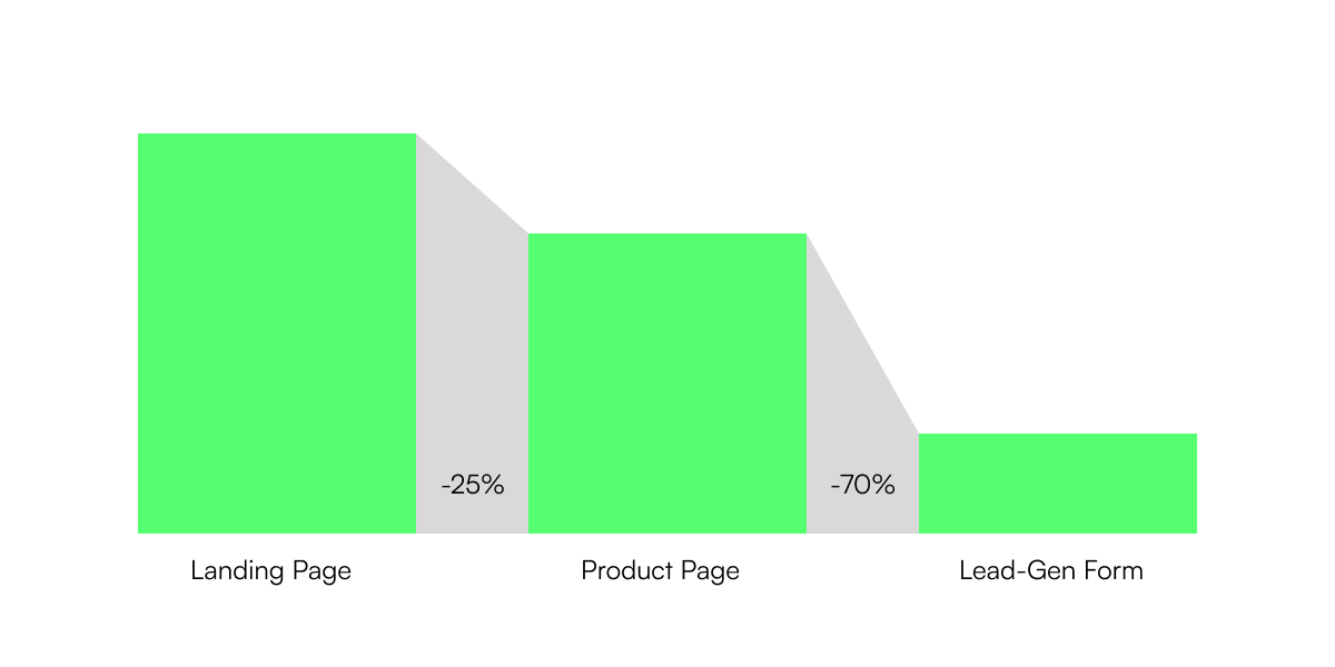
Funnel analysis helps identify them by showing how many users progress from one step to the next. Let’s say your landing page has a healthy bounce rate, and your product page has strong engagement, but your form page sees a sharp drop. That’s your bottleneck. It might be the copy. It might be the layout. It might be the way content is sequenced. But whatever the cause, the numbers tell you where to look.
UX professionals can use this data to investigate the experience at a granular level:
- Are expectations set clearly in the earlier stages of the funnel?
- Does each page make the next step intuitive and low-effort?
- Are trust signals, benefits, and user motivations reinforced where they matter most?
Funnel analysis gives us context. UX gives us answers.
UX insights that move the numbers
Once the bottleneck is found, the next move is diagnosis. Here’s where UX-led content analysis becomes powerful.
For example, if users drop off at a key service page, it’s worth analysing not just design, but message hierarchy. Does the content speak to user goals? Is the value buried under generic headings? Are calls to action being supported by compelling evidence, or are they floating unsupported on the page?
In practice, the best improvements are often behavioural, not cosmetic. Shifting a testimonial block closer to the CTA can reassure just when a user needs it. Splitting dense paragraphs into scan-friendly content can lower cognitive friction. These are strategic UX moves rooted in real behavioural data.
From guesswork to clarity
Funnel analysis takes the guesswork out of UX. It shows not just what users do, but where they hesitate, abandon, or convert. The result is a clear picture of how each page and piece of content supports or sabotages your goals.
For product owners, this means prioritising the fixes that matter. For UX teams, it means aligning design decisions with real user behaviour.
Conversion isn’t a mystery. It’s a process. And the weakest link is usually closer and more fixable than you think. If you’re wondering where yours is, get in touch with us today.


