

Design trends come and go, but few have captured the essence of functionality like minimalism. Minimalism in design is not just about using fewer elements; it is a deliberate approach that fosters clarity, simplicity and purpose.
One of the more topical design trends encapsulating this is the "bento box" layout; a design that uses blocks in variable sizes to form an interesting, modular design.
For those still curious, here are the spark notes: this design is a play on how a traditional Japanese bento box is prepared - a series of rectangles with rounded edges and a sleek layout.
Now, let’s dive in further, starting with: how did the bento box style come about?
Research indicates that the trend may have been inspired by Apple and Microsoft. Apple has always been a huge inspiration to designers and it is not surprising that the bento box trend could have originated from the tech titan. Apple displays featured products in a grid that shows specs and features in the bento box layout. It uniquely presents the specs in a visually interesting way with a variety of visual and typography applications.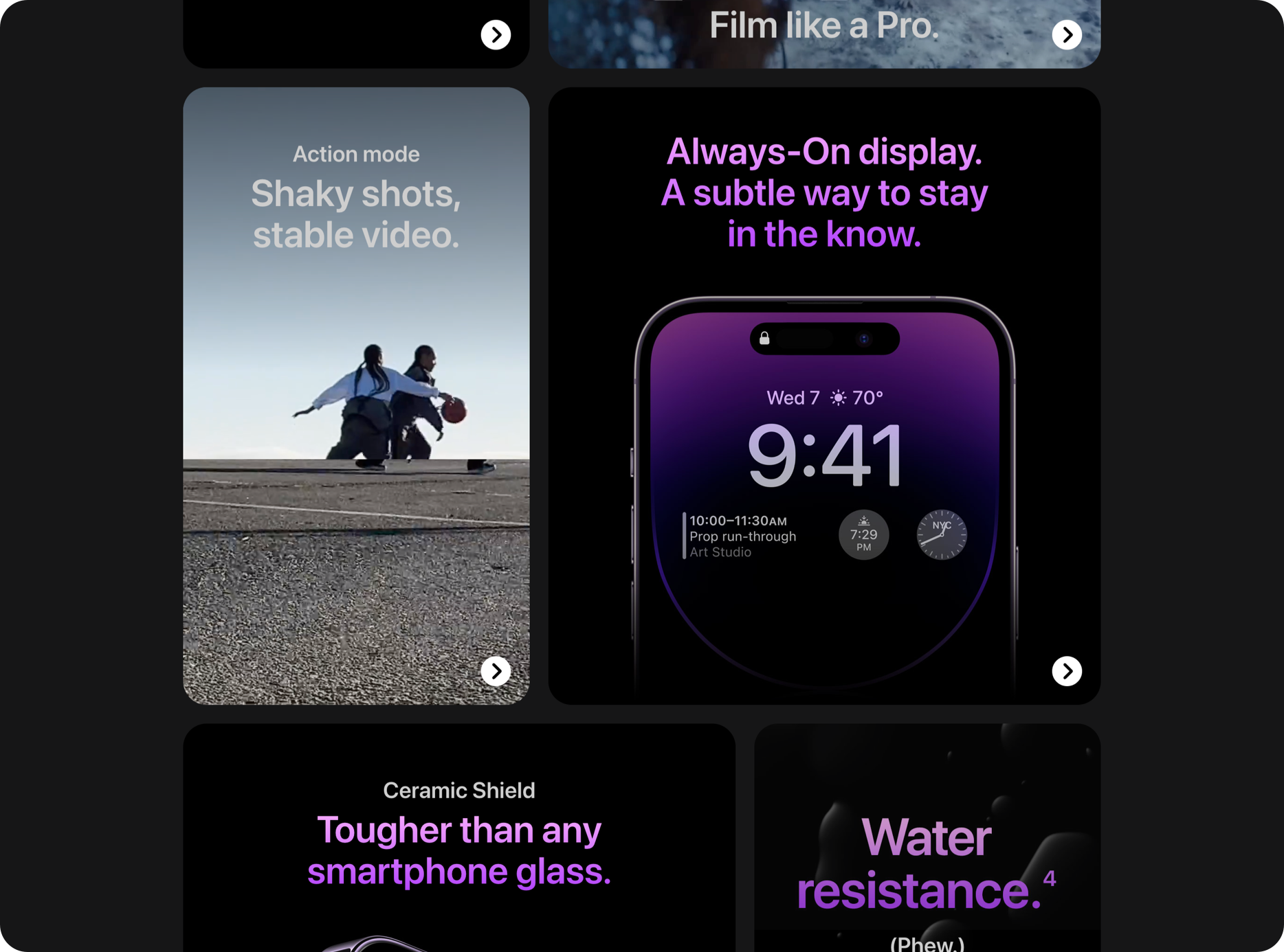
But others argue that the true origin could be from Microsoft when they introduced the Metro Design Language system and unveiled Windows Phone 7. Alas, another Apple vs. Microsoft standoff!
What are the key benefits of the Bento UI design?
The bento style offers significant advantages for creating captivating designs with a clean interface while maintaining strong functionality. Thanks to a straightforward grid arrangement, users can effortlessly navigate and locate content on different screen sizes.
Although still relatively fresh, this style has swiftly gained popularity among designers, developers, and users alike mainly due to:
Simplicity: Bento UI simplifies the task of crafting responsive layouts across various devices.
Structure: It is easy to organise content in a visually appealing hierarchy using Bento UI. The various rounded squares not only create emphasis but also visual interest.
Modern: bento box-style design provides a modern appeal, giving your products that fashionable edge.
Whitespace: Do not forget about the importance of whitespace! This helps to reduce visual clutter and gives the design room to breathe, contributing to a balanced and elegant look without overdoing it.
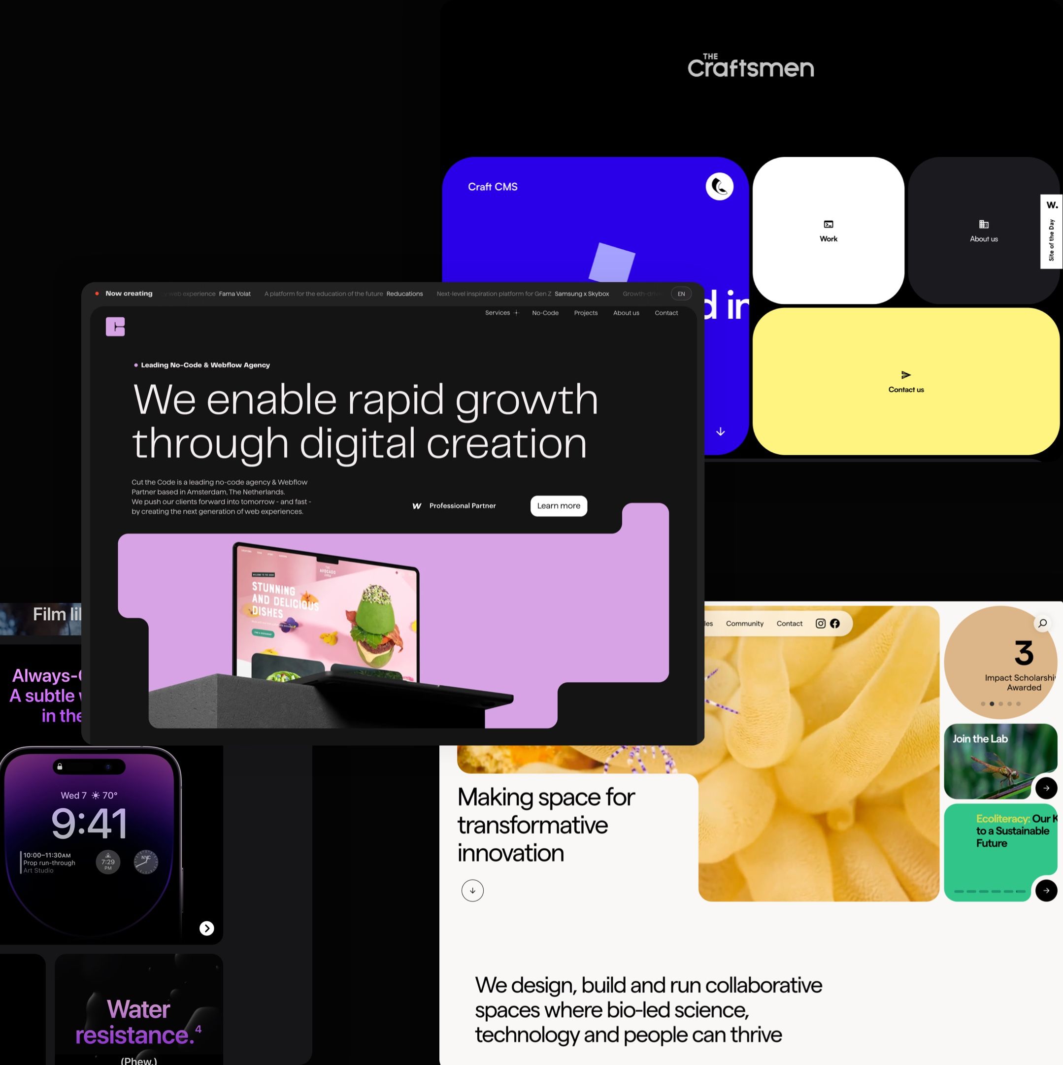
The craftsmen
Developer agency, The Craftsmen, primarily adopted the bento box style in the creation of their website. Navigating through their website offered an engaging experience as visitors uncovered their menus, projects and contact forms. Sometimes, "thinking inside the box" can be a good thing...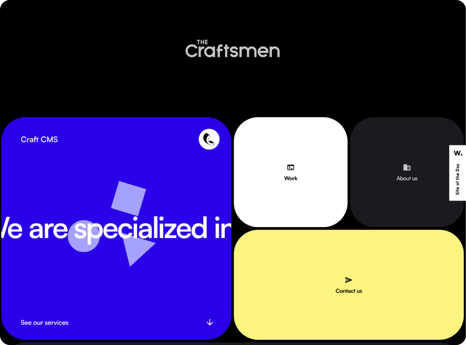
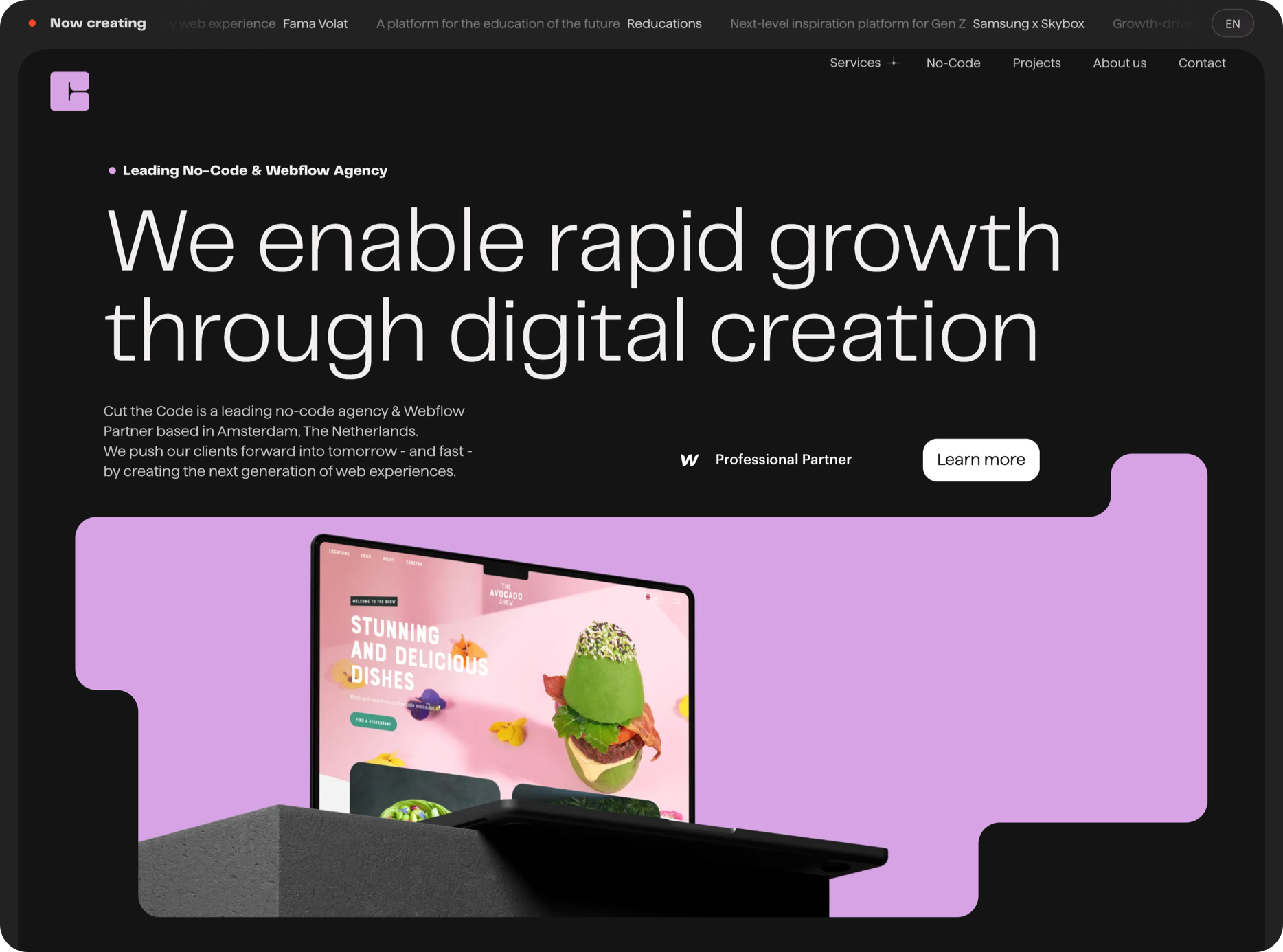
Cut the code
Cut the Code utilised the trend to introduce a sleek dark bento style to their website. In doing so, the site could be configured to display text content above or below images. Ultimately, the website implemented the bento style intelligently, ensuring that the grid style doesn't overwhelm the overall design.
Will we enter overkill mode?
Based on the examples above, it is evident that the bento style is taking the web design world by storm. Not only is the minimalistic trend visually pleasing but can easily adjust to match the personality of each website it is implemented on. However, could the widespread adoption of this trend lead to an excess?
All in all, the bento style introduces a design that is visually appealing, user-friendly and enhances the user experience. Bento UI's grid-based arrangement aids in structuring your website's content into stylish segments. Each compartment serves as an exclusive area to showcase distinct features or highlights. Its simple and effective way of organising content provides value, especially for mobile design.