


Icons have been with us for a long time. In fact they pre-date written language by some time: if we include various pictograms present within European cave art then that ‘some time’ is 30,000 years or so.
Fast forward through history, past cuneiform and hieroglyphics, totem poles and road signage, and the conclusion is unmistakable: humans like pictures, and pictures are able to communicate in relatively small spaces what could take a large number of words (a thousand, for example, to rework one particular cliche).
Even today we can see the power of the icon in action throughout our everyday life. Take a look at the phone screen: what you see is a set of icons. Even though each may not have been ‘obvious’ at first, over time we glance at the screen and have learnt to associate each image with the app beneath it. The alternative - a list or grid of words - just wouldn’t be as effective.
At the same time, however, icons are often used incorrectly or in a way that does more to confuse users rather than help them. This can particularly be the case online. In this short piece I want to walk through some of the core questions you should ask (and answer) when it comes to icons. Starting with the most obvious (but least often asked) one of all…
Do you need icons?
As with almost anything else that ‘everybody’ already does, sometimes we forget to step back and establish that icons are actually necessary for the particular set of circumstances we are in. The best way to answer this question is to consider what icons are FOR and thus figure out if any of them apply in this particular case.
This list isn’t exhaustive, but it will help clear the mind:
- Icons act as great targets, and particularly ‘touch targets’ on the mobile screen. In other words they draw the eye and imply action. In the screen below this list I’ve shown a clickmap analysis from one of our customers, Swrve. It’s instructive the extent to which the icons - and not the titles they are associated with - attract almost all the clicks. Humans like pictures.
- They are either instantly recognisable - or can become so over time. In some cases (and we’ll discuss this in a little more detail below) the visual shorthand that icons embody can save time and mental load for the user.
- Icons can be used to imply the concept of family. If you have a range of products but wish to convey a sense that they are suite (think Microsoft Office) then icons can convey that particularly well. In that situation, icons may definitely be worth investigating.
- Icons are international. Although in most cases you will use icons alongside words, the pictures themselves can be used within the UI for any language without requiring any change.
- Lastly, icons can simply be used for aesthetic reasons alone. They look good, or at least they look better than words alone, provided they are of sufficient quality.
If at least two of these reasons apply to your own site or product, you might want to investigate using icons within site, product and landing page design - and indeed across any other relevant media.
This heatmap analysis of icons from swrve.com demonstrates the extent to which the human eye (and click) gravitates towards icons and away from text
Should you re-use icons or build your own?
As a starting point, it’s always the right move to re-use any icons for well established concepts. Users are by now well used to certain conventions, and there’s almost no benefit in attempting to re-invent the wheel. The ‘hamburger’ menu is one more recent example of an icon that is becoming well understood by users. An even more extreme example is the by now ubiquitous on/off icon that is understood all over the world by almost every user.
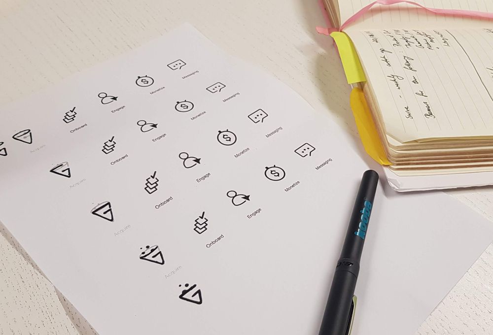
Even when considering icons for more abstract concepts or features, it is still worth considering what is already there rather than starting from scratch. It can save a good bit of time for one thing, but again the key consideration is user familiarity. It is essential to always remember that icons succeed or fail based on memorisation - any head start in that area should be taken advantage of. At Kooba we would always take a good look at Font Awesome, Material Design, and The Noun Project amongst others, even if only for inspiration. Don’t forget that icons on these sites can be used as is or edited to make them fit your exact requirements.
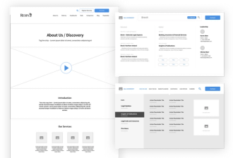
Sometimes, however, you’ll want to produce your own icons from scratch. The phone screen is again an example of when this can be the case. It’s not really either possible or desirable to reduce your business or service to a single off the shelf icon. You just have to allow the user to get used to your choice over time. The same applies to icons that depict elements of a product line. In many cases you’ll want to do original work in this area.
Which leads on to the next question:
What types of icons should I produce?
Before we answer that question, one word of advice: in almost all cases it is wise to use icons alongside text. At first that may seem counter-intuitive. Aren’t icons, after all, intended to save space and provide visual shortcuts? Well, yes and no. In the vast majority of cases icons are too ambiguous to be left to their own devices. Unless you are absolutely sure your icons are self-explantory (and it’s easy to check by asking potential users), then remember you are designing for use alongside text.
After that it’s a question of meaning and fashion. To dispense with the latter first, this is simply what users expect and convention dictates in terms of style of execution. Over recent years we’ve seen icons evolve from almost photo-realistic images to simpler, flatter and more elegant designs. But they may go back the other way….
Conveying meaning is more interesting. Here we are considering the choice of subject for any given icon or set of icons. There are a number of ways of approaching this, of which these are probably the main three:
- Icons can have a direct resemblance or at least close resemblance to the thing they represent. A good example is the camera icon on most modern smartphones, which is, well, a picture of a camera.
- Icons can use analogy, or refer to the results or actions associated with a particular feature. Into this category (which is harder to pin down) I would put the Launchpad ‘rocket’ icon in MacOS or the sun used commonly as an icon for weather apps.
- Lastly, icons can be completely arbitrary, or at least effectively arbitrary to the user. I would include the ‘cog’ settings icon and the classic on/off example shown above in this category. To all intents and purposes these icons could be almost anything. Certainly anyone newly arrived on the planet would find them difficult to decode - but long-term use and familiarity renders them immediately understandable.
Ideally, for any family of products or features, your icons will belong to one of these categories and one alone, rather than mixing and matching. It doesn’t help the user to use a very literal icon for one particular product or feature, and an almost entirely abstract one for another - particularly when they are in the same family.
The first two categories probably need no further explanation - and most of the examples found on sites like those referenced above will fit into these groups. But although the last category might feel like the least promising approach, it can pay dividends to be completely original when creating icons for a product range. Used alongside words or proper names, they don’t need to carry the burden of communication alone, but rather can be designed for memory and recall over time.
In some ways this approach is not far from the concept of colour-coding and can be understood in the same way. There’s no particular reason why Powerpoint is red and Excel is green after all. But over time those associations stick and provide that visual shorthand we were talking about above. As an example of this, we like the Zendesk Suite. It would be optimistic to claim that the icons for ‘Support’, ‘Chat’ and so on could work alone, but alongside the text they certainly do. They are memorable, fun, and consistent. In icon design, originality can pay.