


The challenge of creating homepages is pretty exciting to us. In many cases, it’s the first thing people see when they land on a website, so driving action in those first few moments is crucial. Here are a few of our favourite homepage design psych principles that will enhance your digital first impression:
1. Copywriting creates an impression in seconds. Make them count.
Clear copy is hard to master, because it means driving behaviour in very few words. But a good way to distill it down is to focus on answering these three key questions: What is my business? What do we do? And finally, what do we want our site visitors to do on the site? Jot down 3 words for each of those questions, and craft short messaging from there.
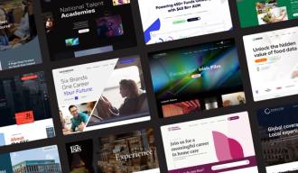
Here’s an example from our recent National Talent Academies website project. It begins with a proud announcement of who they are, followed by a no-fluff description of what they offer. Finally, a short CTA for their desired action: View All Courses.
2. Make people feel seen
Another strong way to get peoples’ attention is to know who they are and literally call them out. In conversation, people are more likely to listen to you (and like you) if you address them by name. The same can be applied to web design. If users see something about who they are, they’ll be more likely to interact.
Take Repak’s Team Green campaign homepage. The page leads with a toggle for the public or for members– the great thing about this is that you’re either one or the other. People will feel heard, seen, and will be more likely to take some sort of action.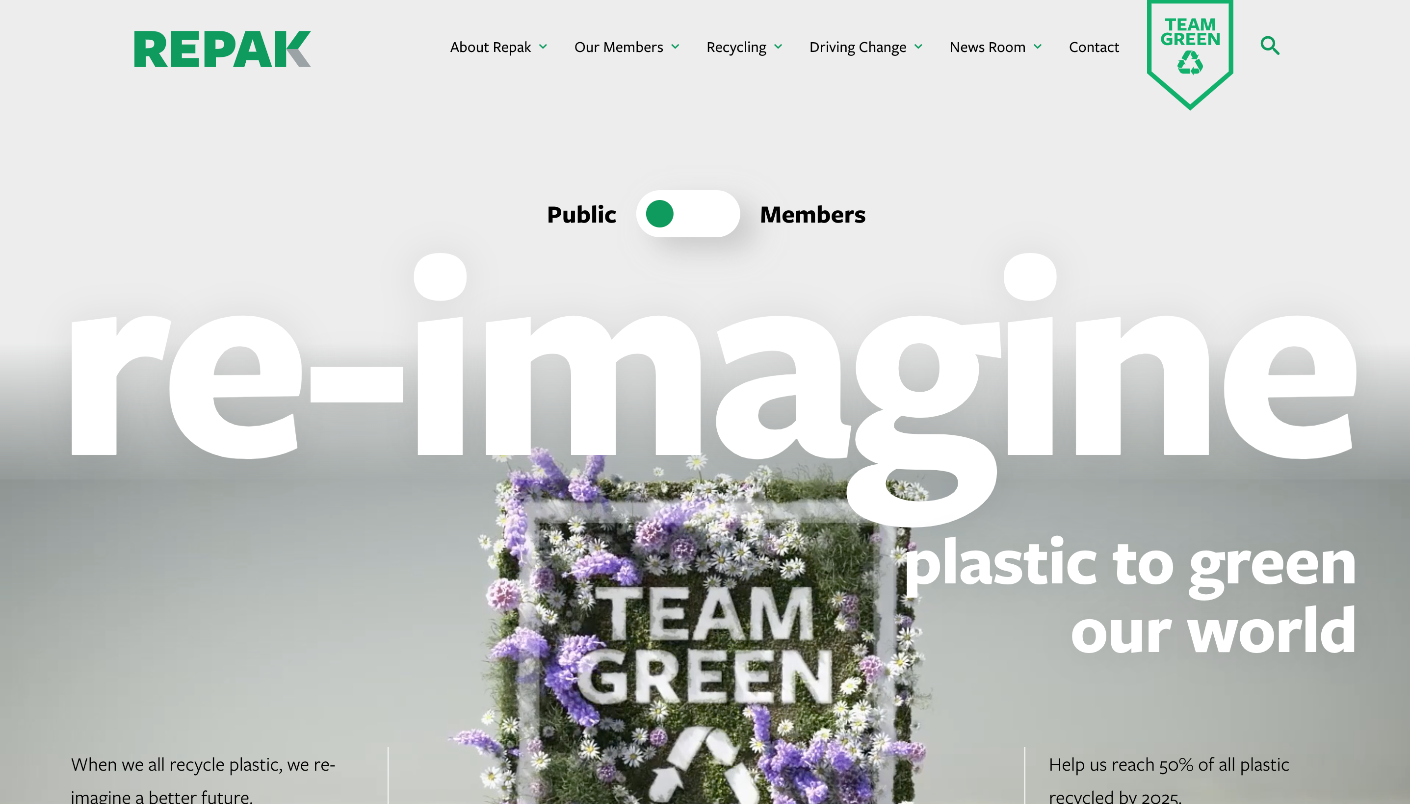
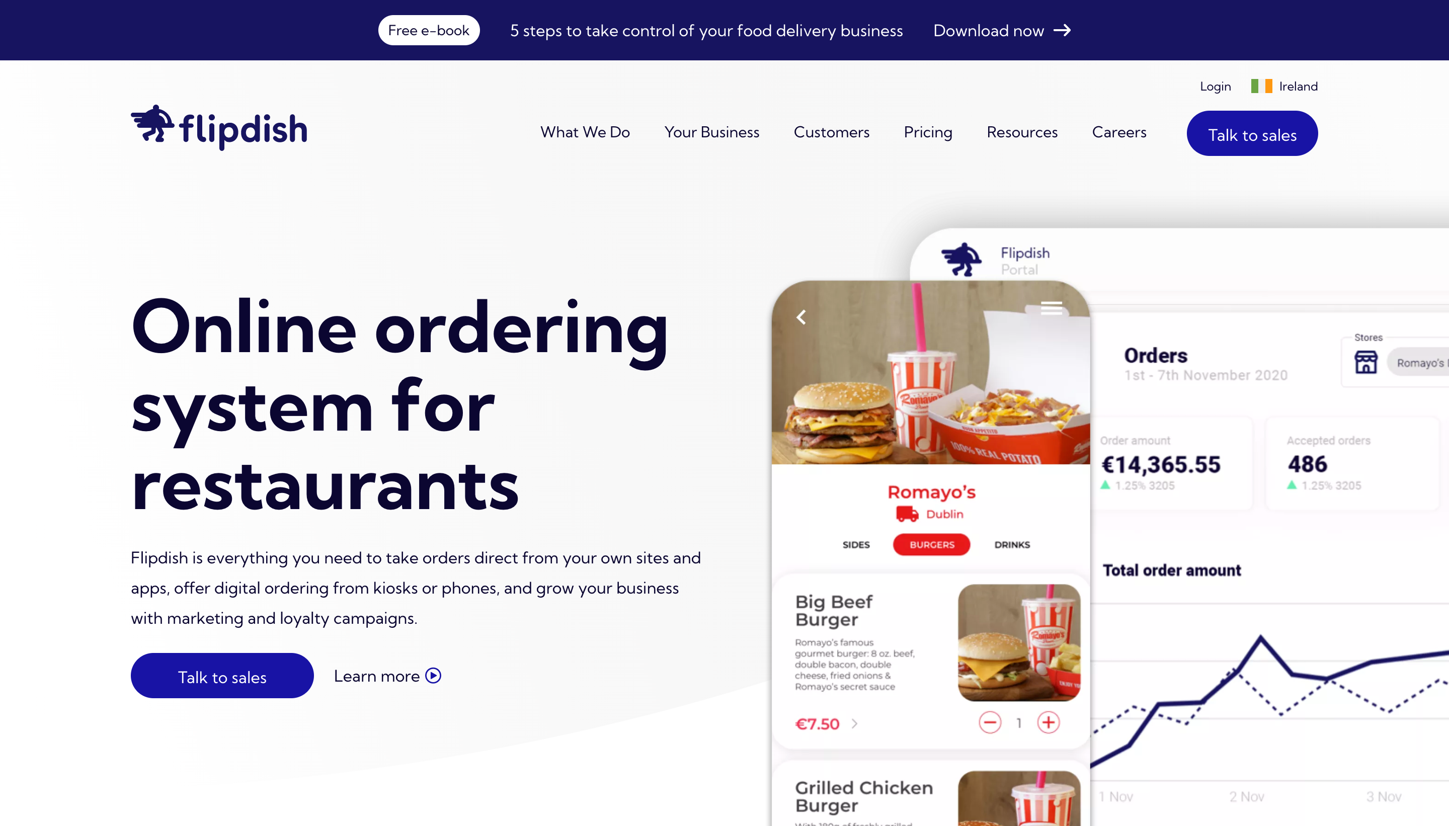
3. Show the product tactfully
There are so many ways to display a product, whether it’s a physical one or a software service. As long as us humans have been creating things, we’ve been putting similar effort into displaying them. Successfully displaying a product communicates as much about the product as the functionality itself.
In Flipdish’s case, they wanted to highlight their digital solutions for the food ordering ecosystem. The way the product is displayed on the homepage negates any uncertainty; it shows site users what they’re getting. And it was hardly a thoughtless selection of screens displayed. The visual shows responsive design on desktop and mobile, while also showing the product from consumer and business perspectives. All in one glance.