Overview
A leading investment firm in infrastructure, energy, digital and utilities sectors
Rubicon approached Kooba with a site that was functional, but had potential for massive benefits with a refresh. To more accurately portray the picture of Rubicon as a company, certain priorities became clear after an in-depth analysis: creating a clearly corporate-esque website, showing global reach while maintaining a personal ethos and positioning Rubicon as a trusted source for financial investment.
View the site
rubiconcapitaladvisors.com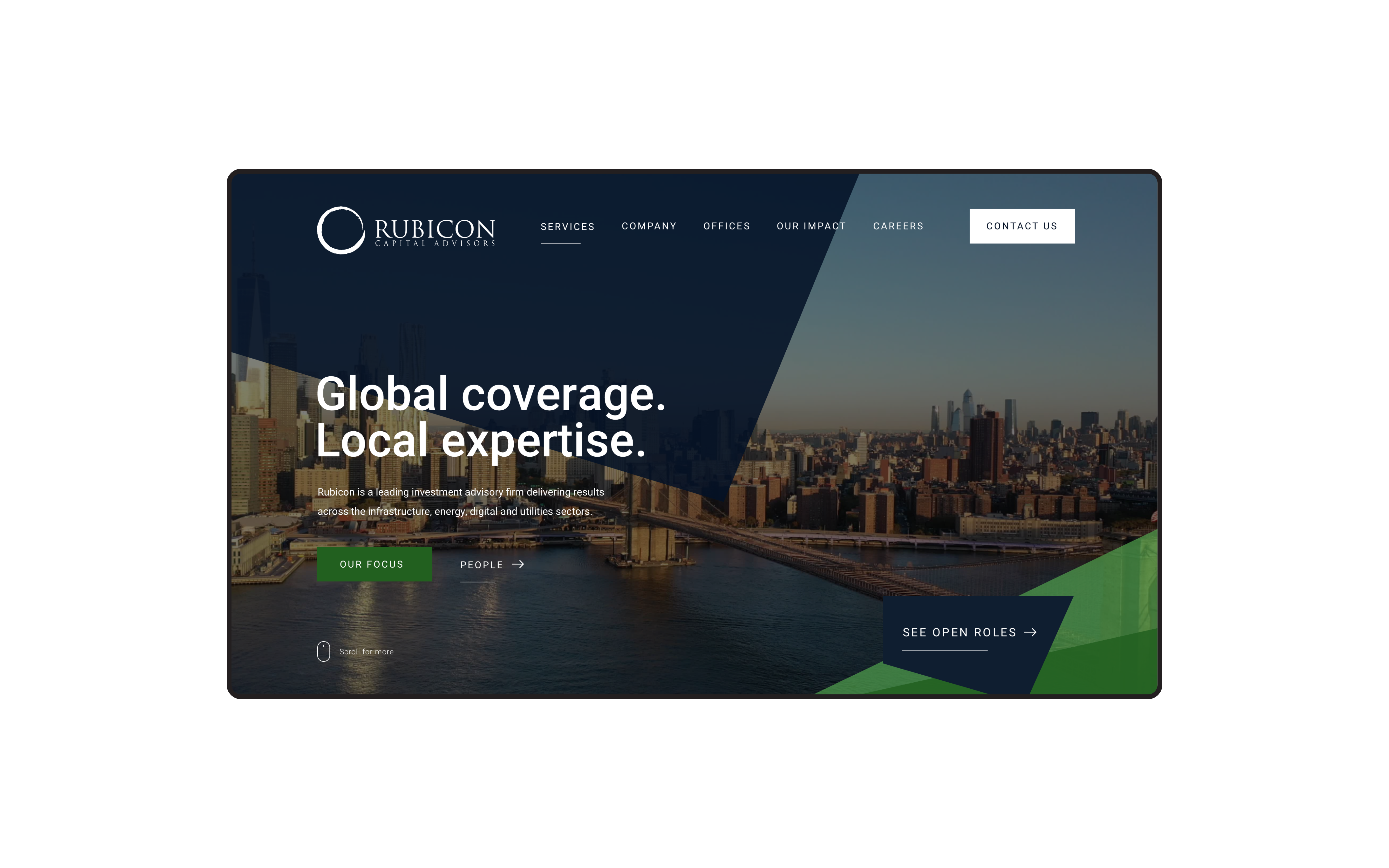
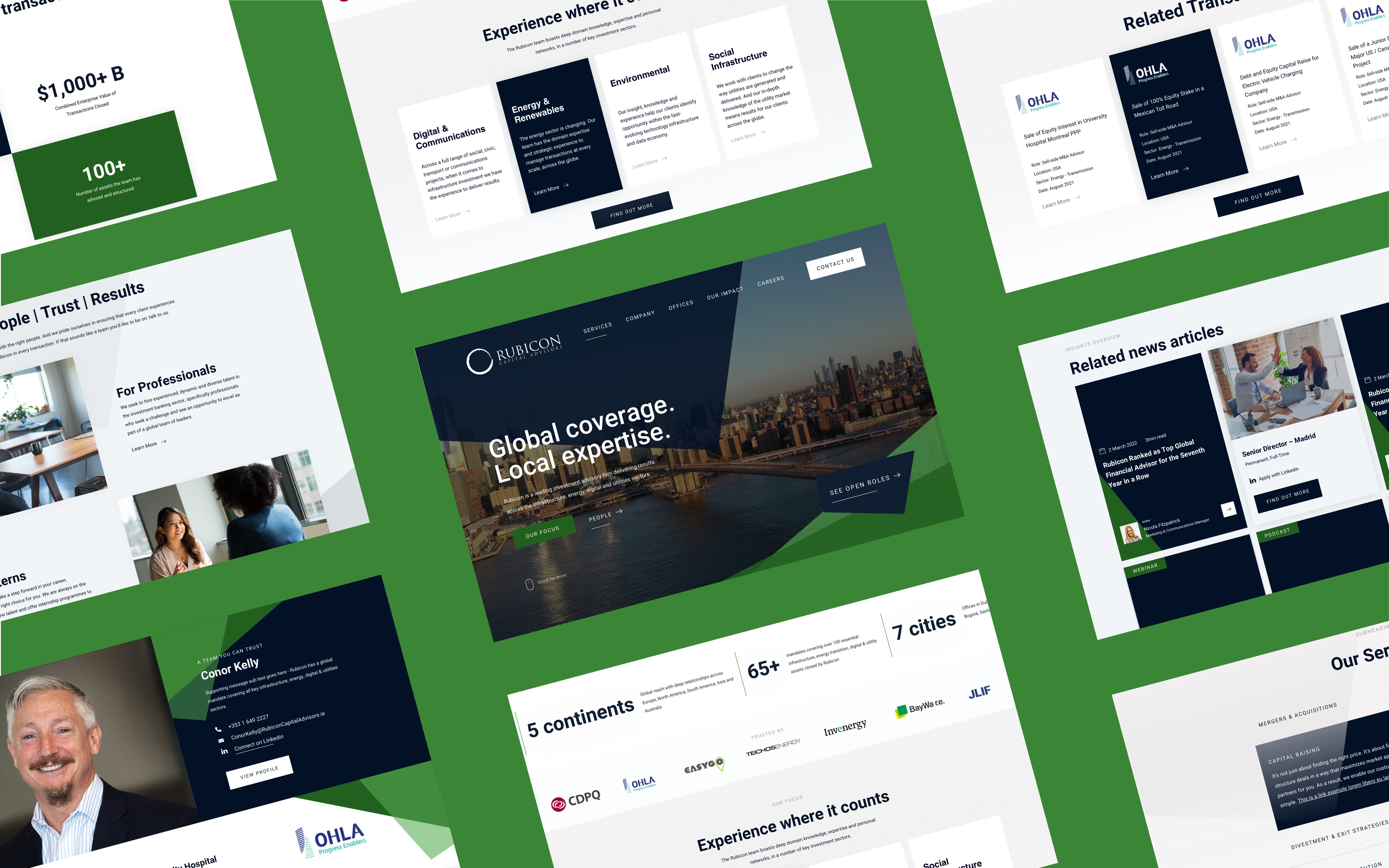
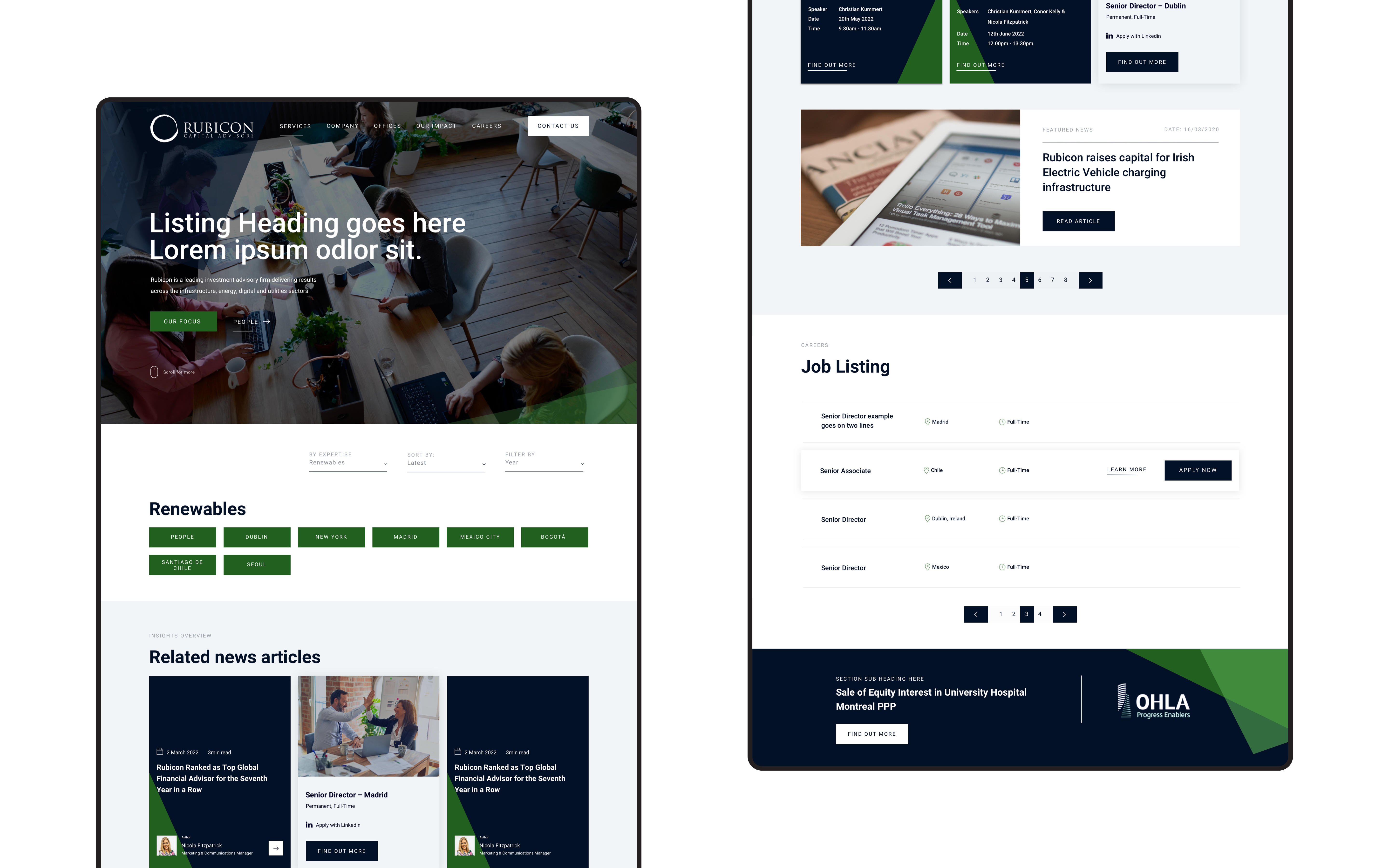
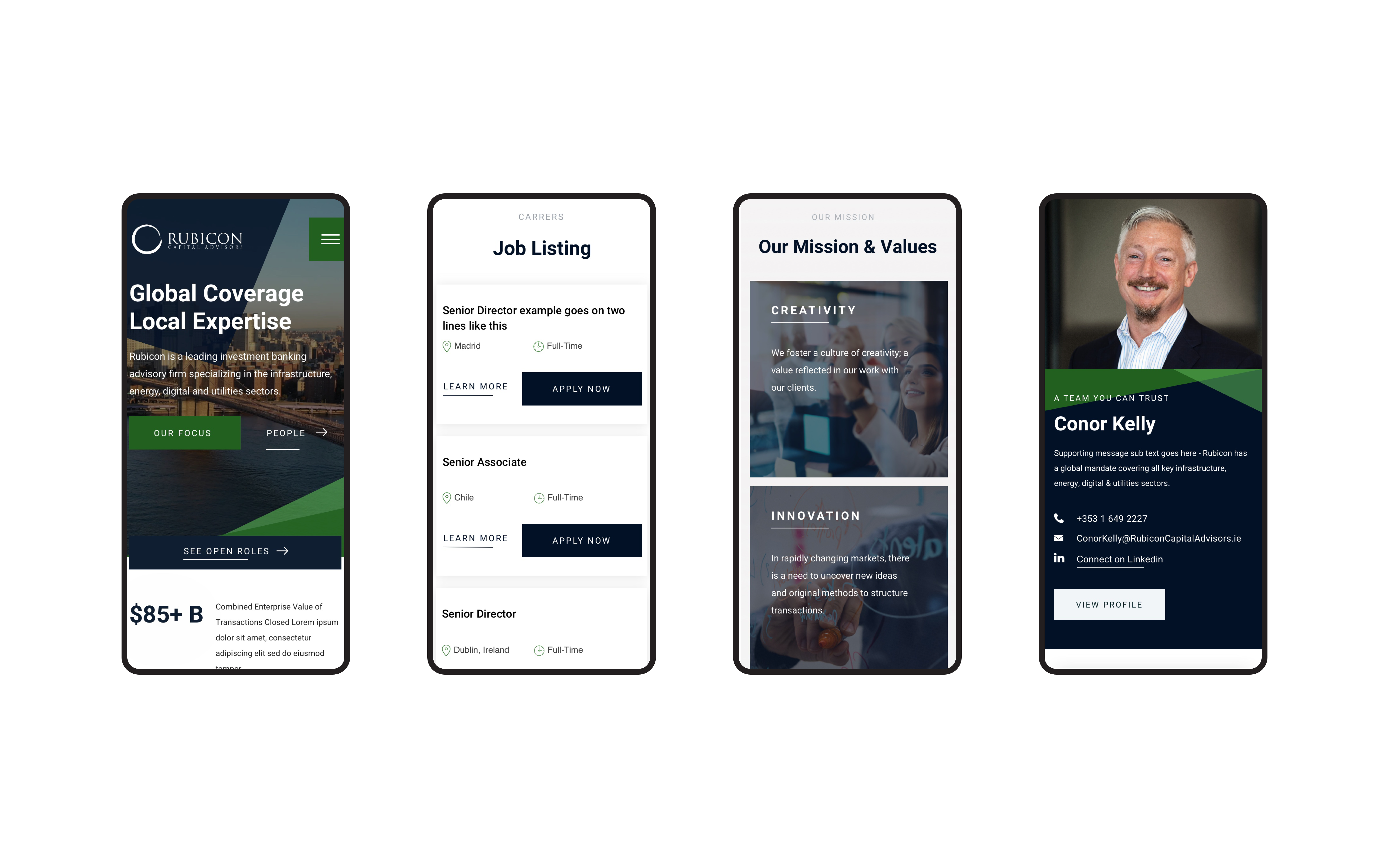
A refined corporate identity
A key goal was to modify the site to more closely align with a financial corporate identity. The previous site more closely mirrored elements of cybersecurity rather than financial investment; the new site needed to clarify what exactly Rubicon does as an organisation. Our designers researched trending corporate web design, and took inspiration from past projects such as A&L Goodbody and Digital Health Global Education (DHGE). The challenge was to maintain traditional corporate design elements while including cutting-edge features in the process to keep the user engaged.
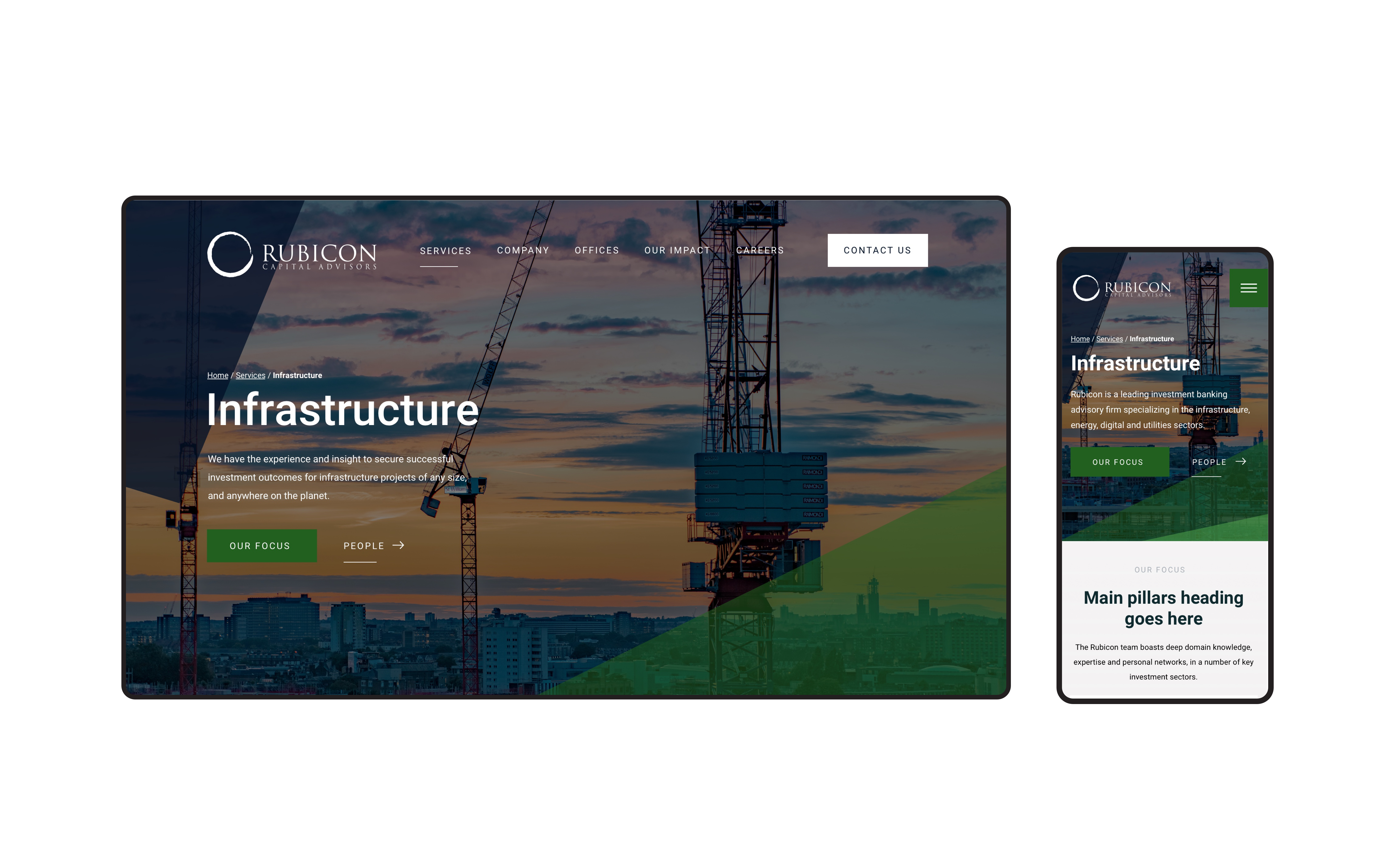
Designing for trust
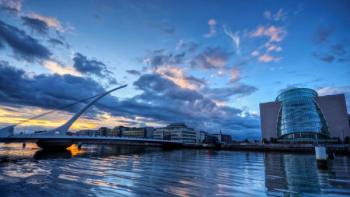
Brand positioning played a key role in the project. The goal was to position Rubicon as a trusted source for investment in their specific industries. Certain creative decision were made to enhance this. You'll notice elements of the design are sharp; sharp features suggest authority and confidence. We also prioritised building the site around straightforward content that spotlights Rubicon's services. We strategically introduced navy blue to the Rubicon colour palette; a colour often associated with trust, banks and traditionally corporate brands. Lastly, we replaced the old site imagery of a globe (a relatively dated asset) with a video series of cityscapes instead which make the website more dynamic.
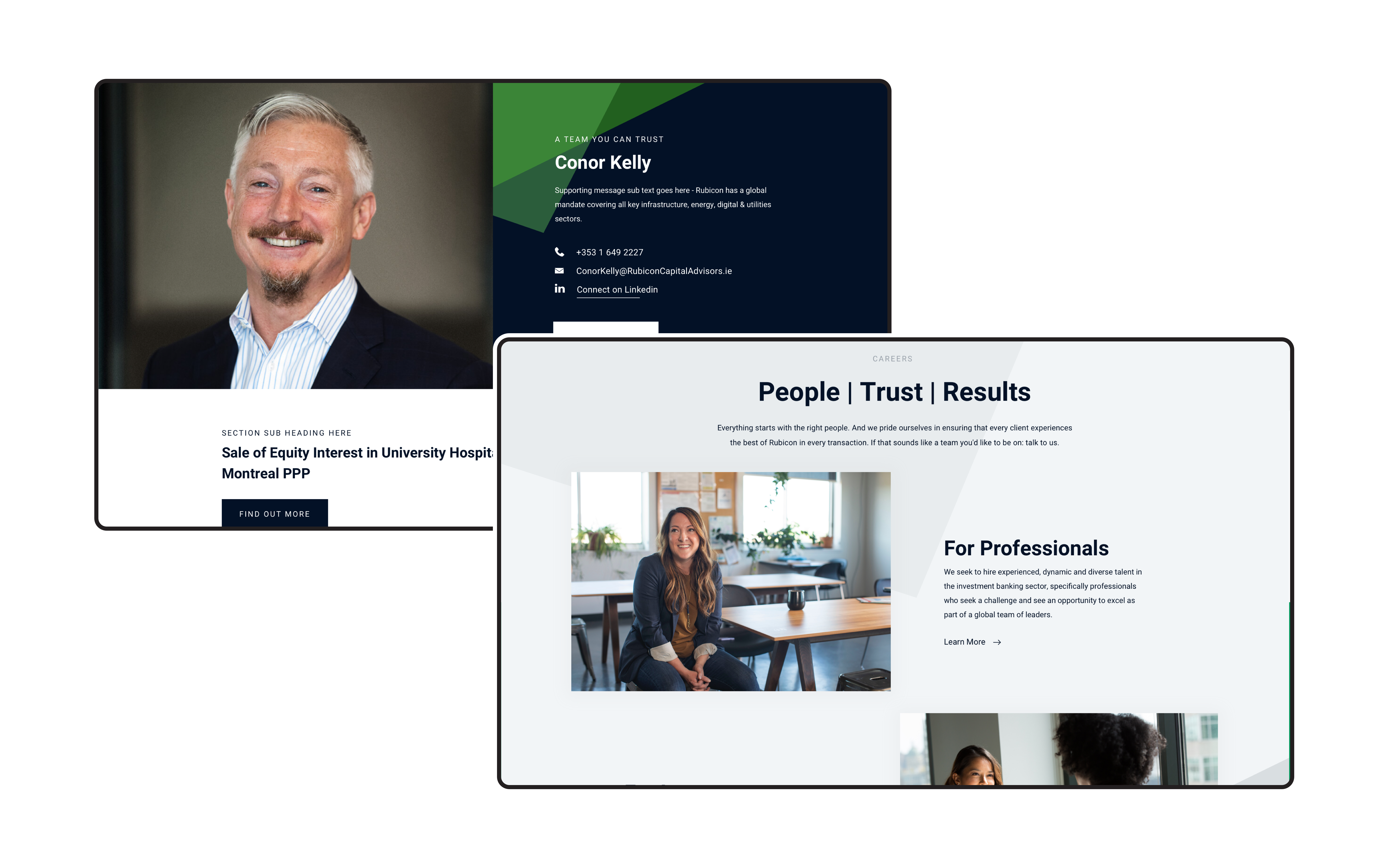
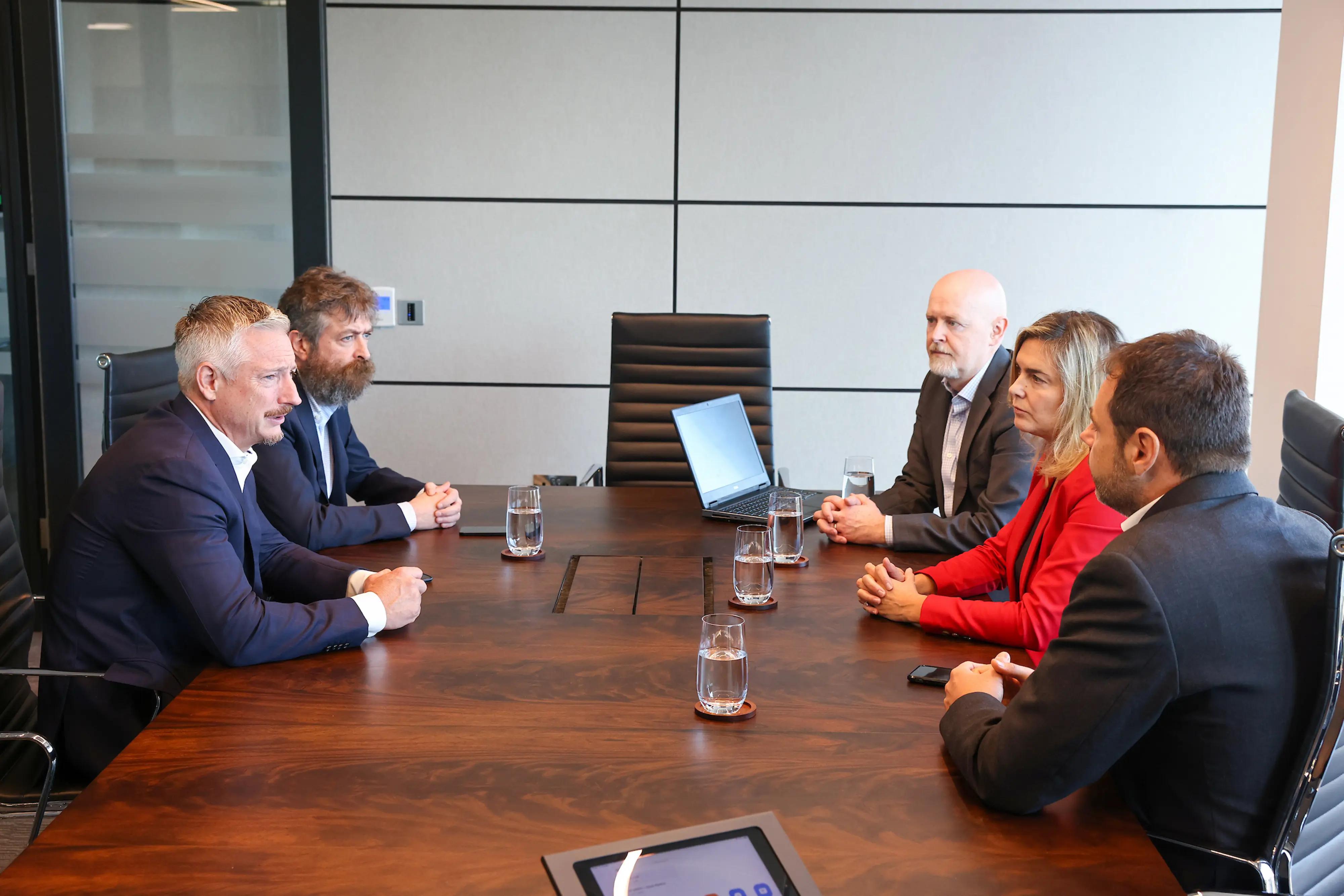
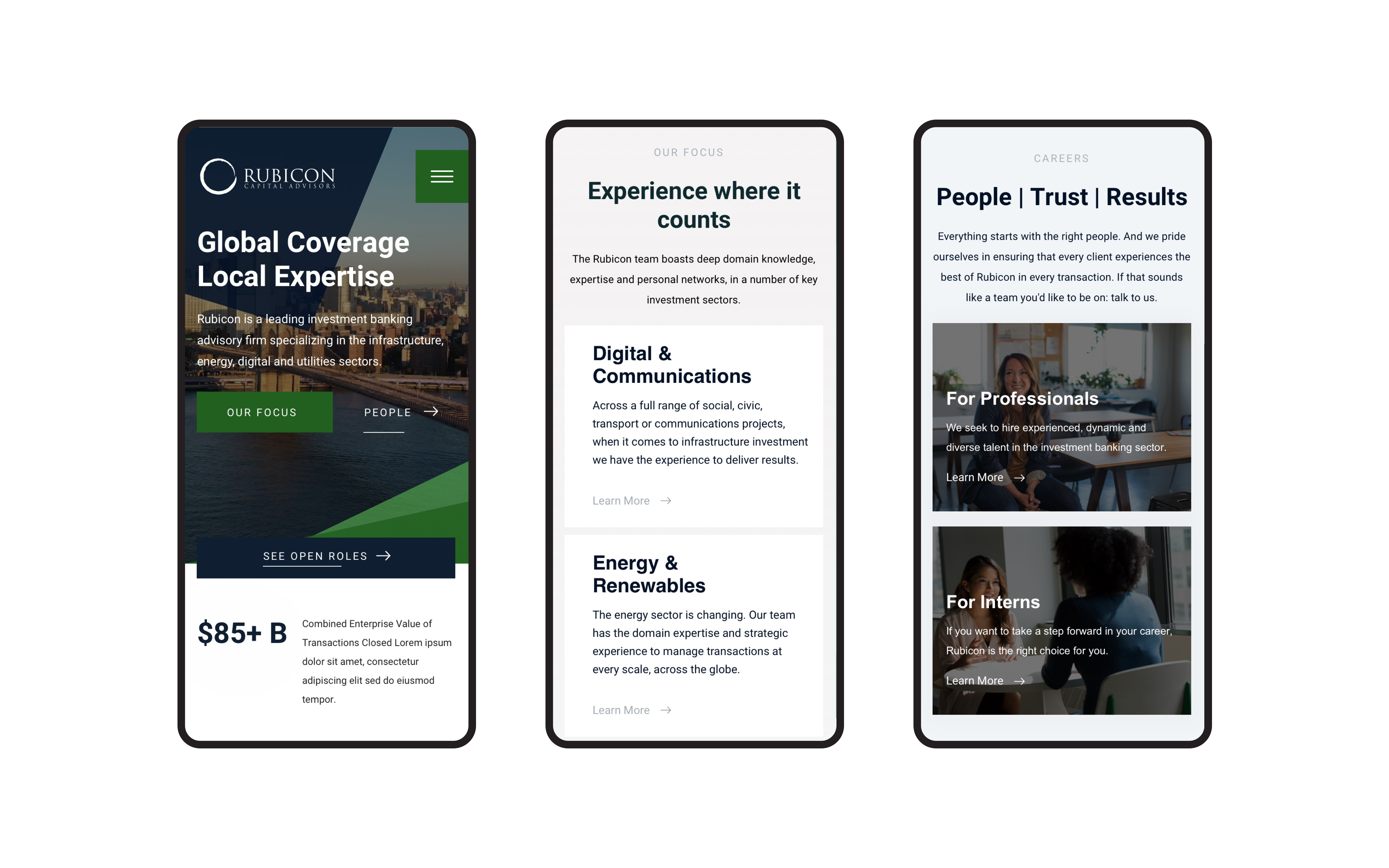
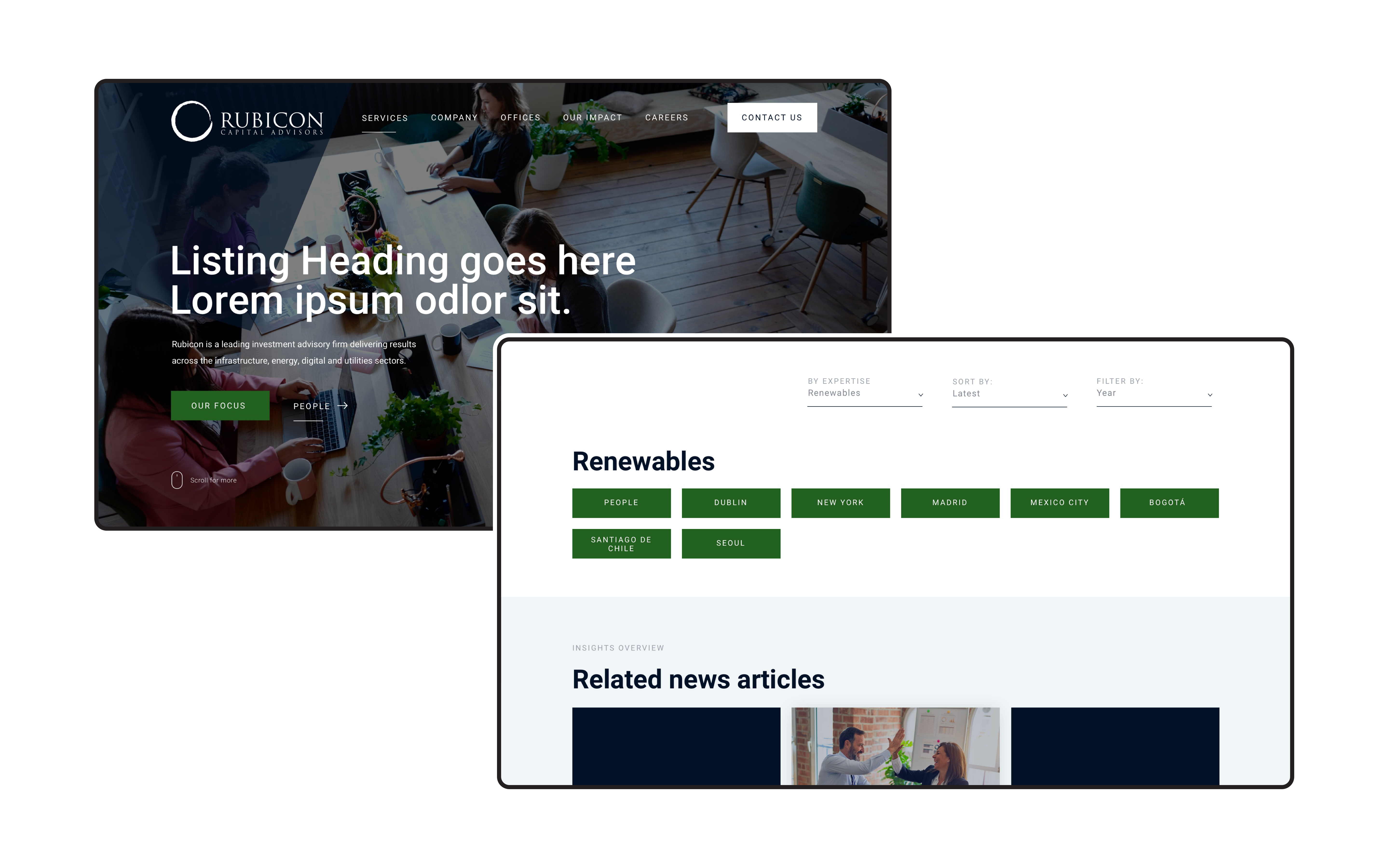
Global yet personal
Another priority of the design was to centre the people of Rubicon – to show their lifestyle. At the same time, Rubicon wanted to emphasise the global reach of their company. We achieved this duality by incorporating imagery of the CEO and other Rubicon members on the homepage. We then replaced the original hero banner with video content of the cities where Rubicon offices are located; this switch gave the site a more human ethos while also reinforcing the company's global presence.
What we did
- UI / UX design and development
- Information architecture
- Content strategy and development
- CMS integration


The result
A picture of credibility & culture
The new site clearly and accurately spotlights Rubicon’s services, transactions and key clients. Since launch, the new design has delivered on several KPIs such as driving more traffic to Rubicon's Careers and Internship Program. Overall, the site achieves the balance of illustrating Rubicon as a trusted, global, financial institution while also showcasing their people and organisational culture.